CARLOS I
Brand Redesign
For over 135 years, Carlos I has stood as one of Spain’s most distinctive dark spirits. Born in Jerez and shaped by grape distillation, the Criaderas and Solera ageing system, and maturation in very old Osborne sherry casks, it carries a richness that isunmistakably its own.
Read the full story
Carlos I
Brand Redesign
Its name evokes stature. Its liquid speaks of depth. Its heritage is singular.
And yet, in an increasingly crowded premium spirits world, Carlos I had become more admired by those who knew it than noticed by those who did not. Its historical codes and prestige appeal were intact, but too discreet. Its authority was real, but visually contained.
The opportunity was not to make Carlos I louder for the sake of attention. It was to give a spirit with such a commanding name, origin, and character the courage to be fully seen.
Our ambition was to transform Carlos I from a brand of quiet gravitas into one of magnetic presence, without sacrificing the heritage that made it iconic.
The challenge was not reinvention, but revelation.
How could we make Carlos I feel more visible, more desirable, and more culturally alive, while preserving its royal symbolism, its Spanish identity, and the loyalty of those who already knew it? How could a brand rooted in legacy step forward with confidence, making more of its extraordinary assets without retreating into nostalgia?
Carlos I needed to assert itself in the broader world of prestige dark spirits, not by borrowing codes from elsewhere, but by amplifying its own. Its name, its knight, its sherry-cask story, its Jerez origin, and its deep amber character all had to become more immediate, more legible, and more iconic.
Across the portfolio, this meant building a clearer, bolder, more coherent visual system: one capable of holding stature at close range while commanding attention from afar.
At the heart of the work was a simple conviction: A spirit called Carlos I should never disappear into the shadows.
We created a design evolution that gives Carlos I a new visual confidence.
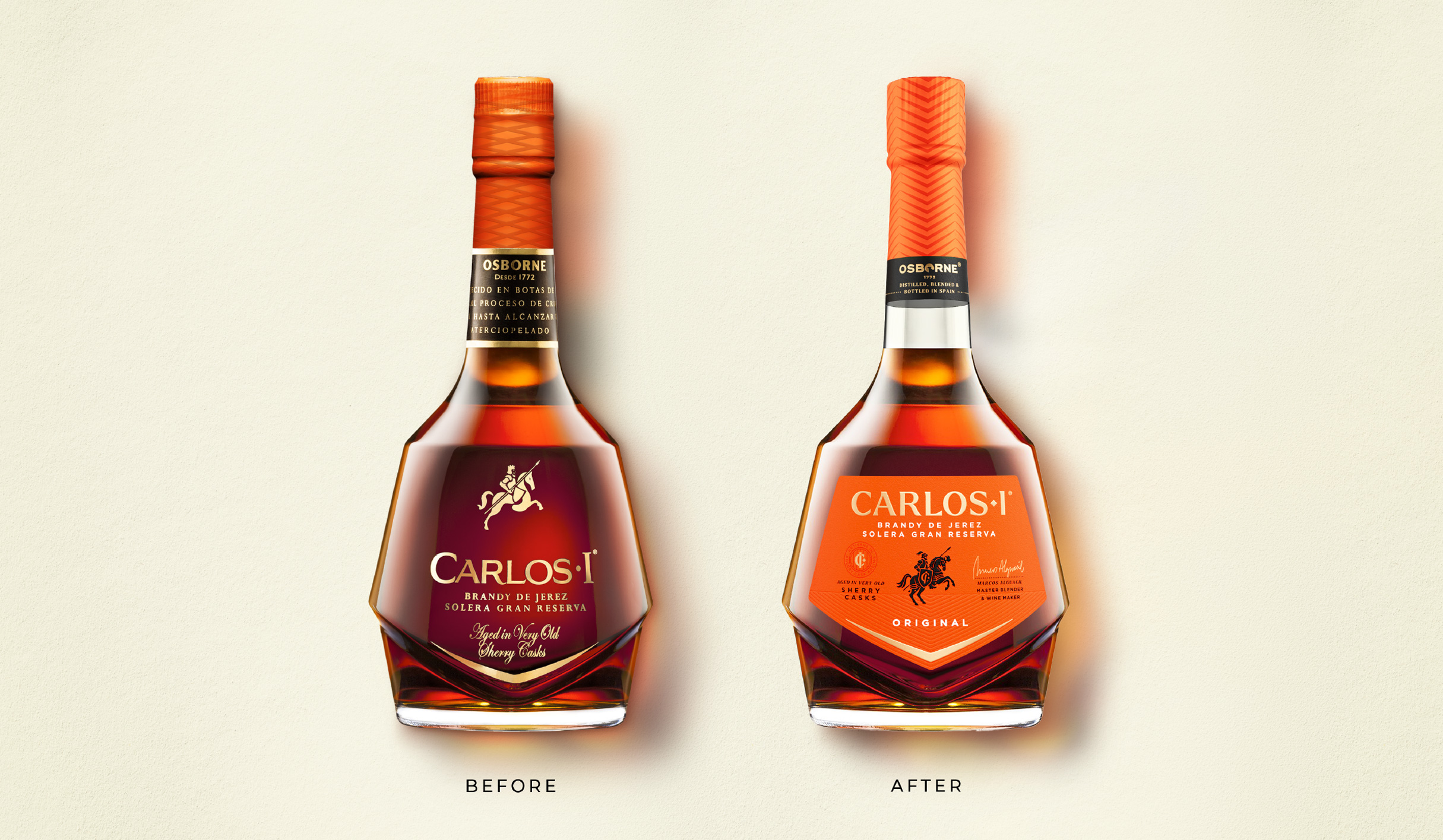
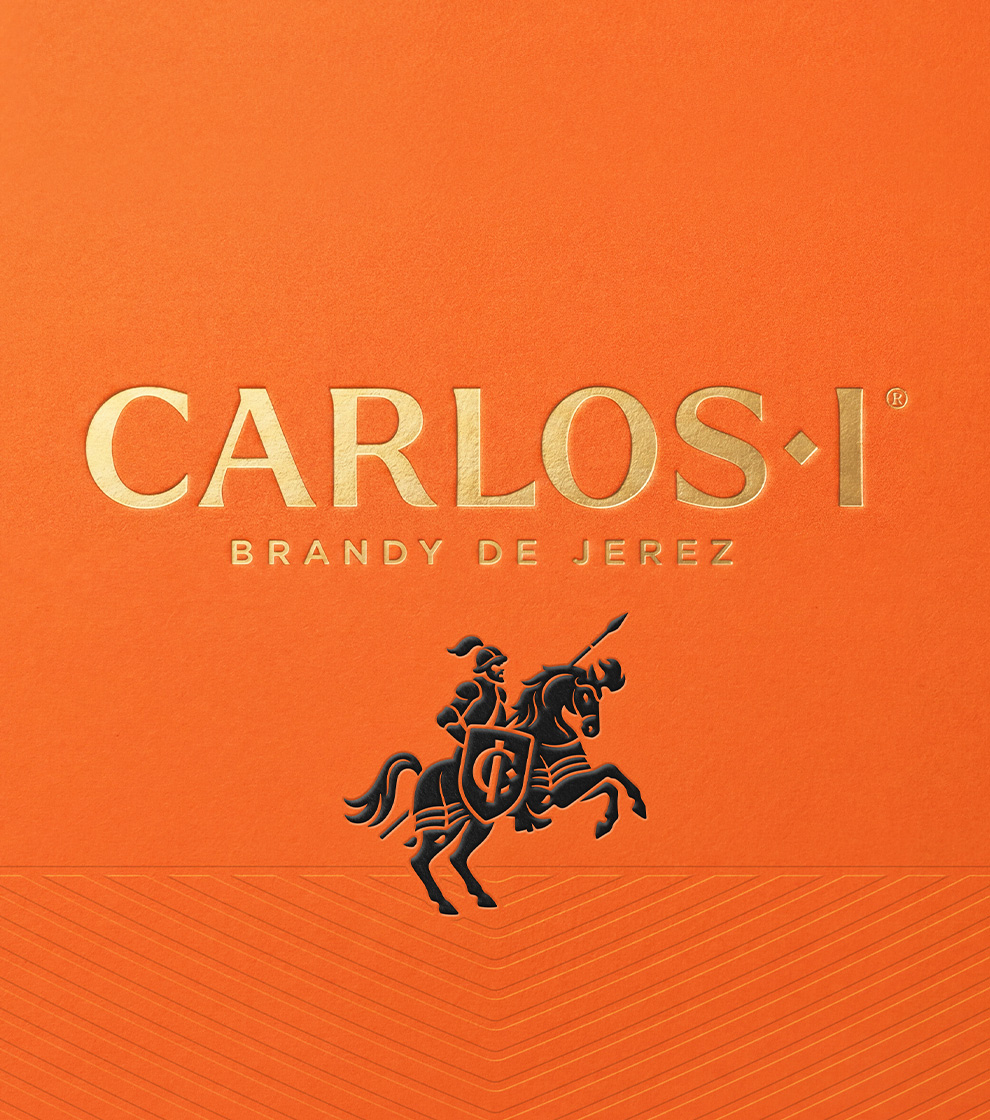
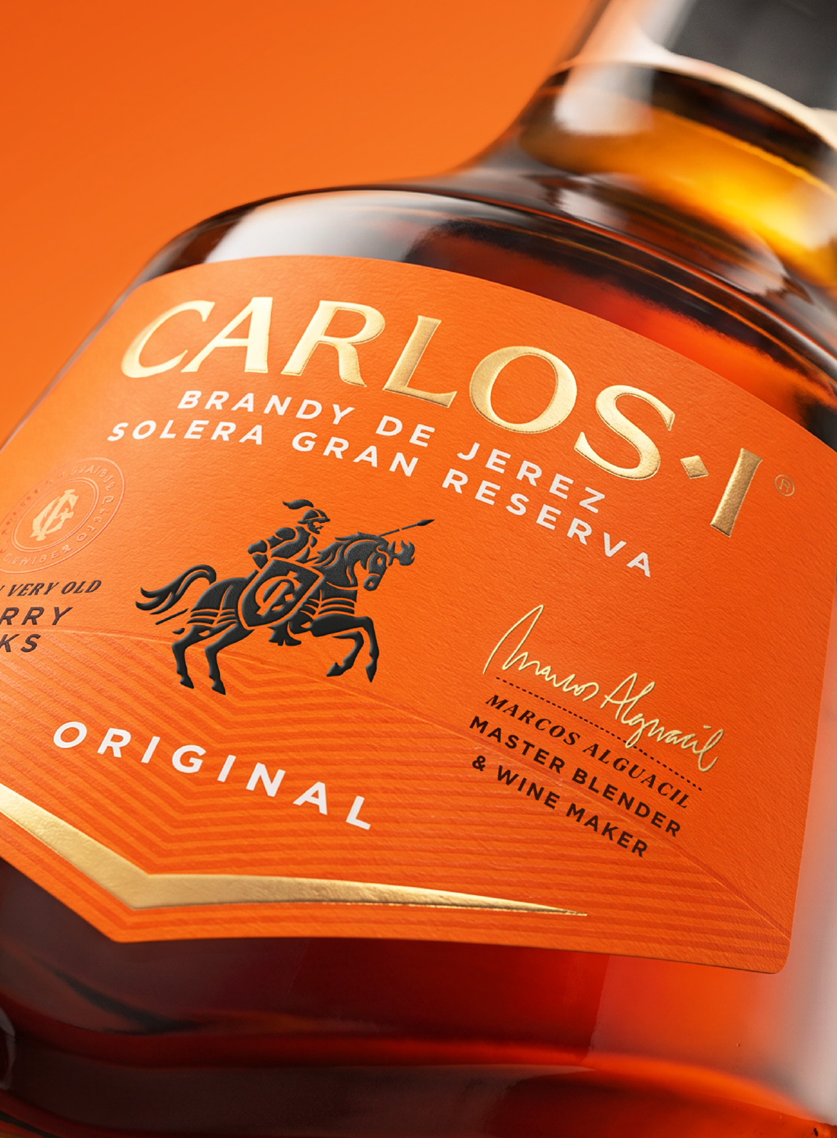
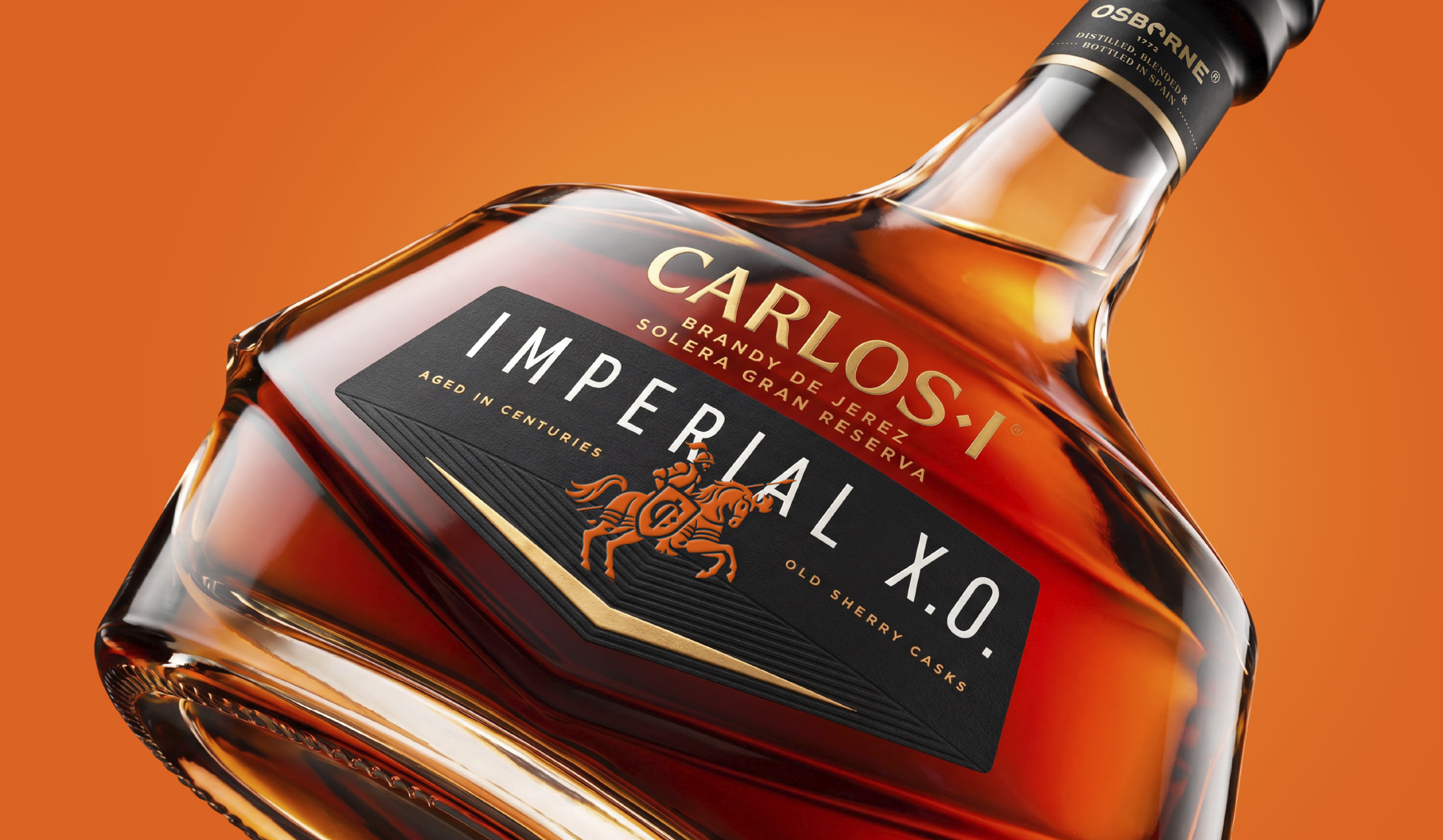
The redesign brings the brand forward. A larger, more assertive Carlos I wordmark occupies the centre of the bottle with renewed authority. The knight symbol becomes a stronger emblem of legacy and command through a fully redrawn illustration.
Most powerfully, colour becomes an act of visibility. The vivid orange of the core expression breaks decisively from the darker, more recessive language of the previous design. It catches the eye, radiates warmth, and gives physical form to the spirit’s intensity.
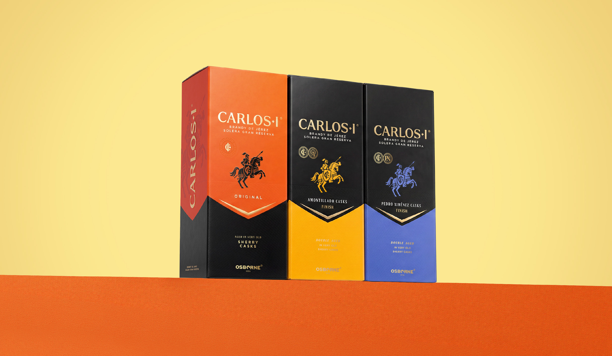
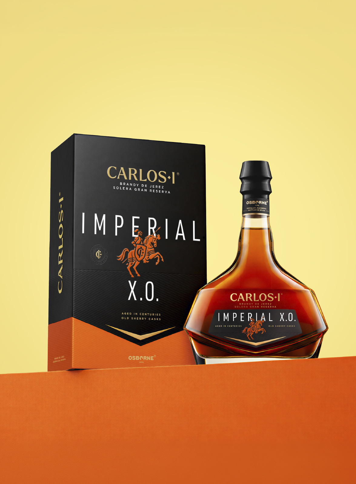
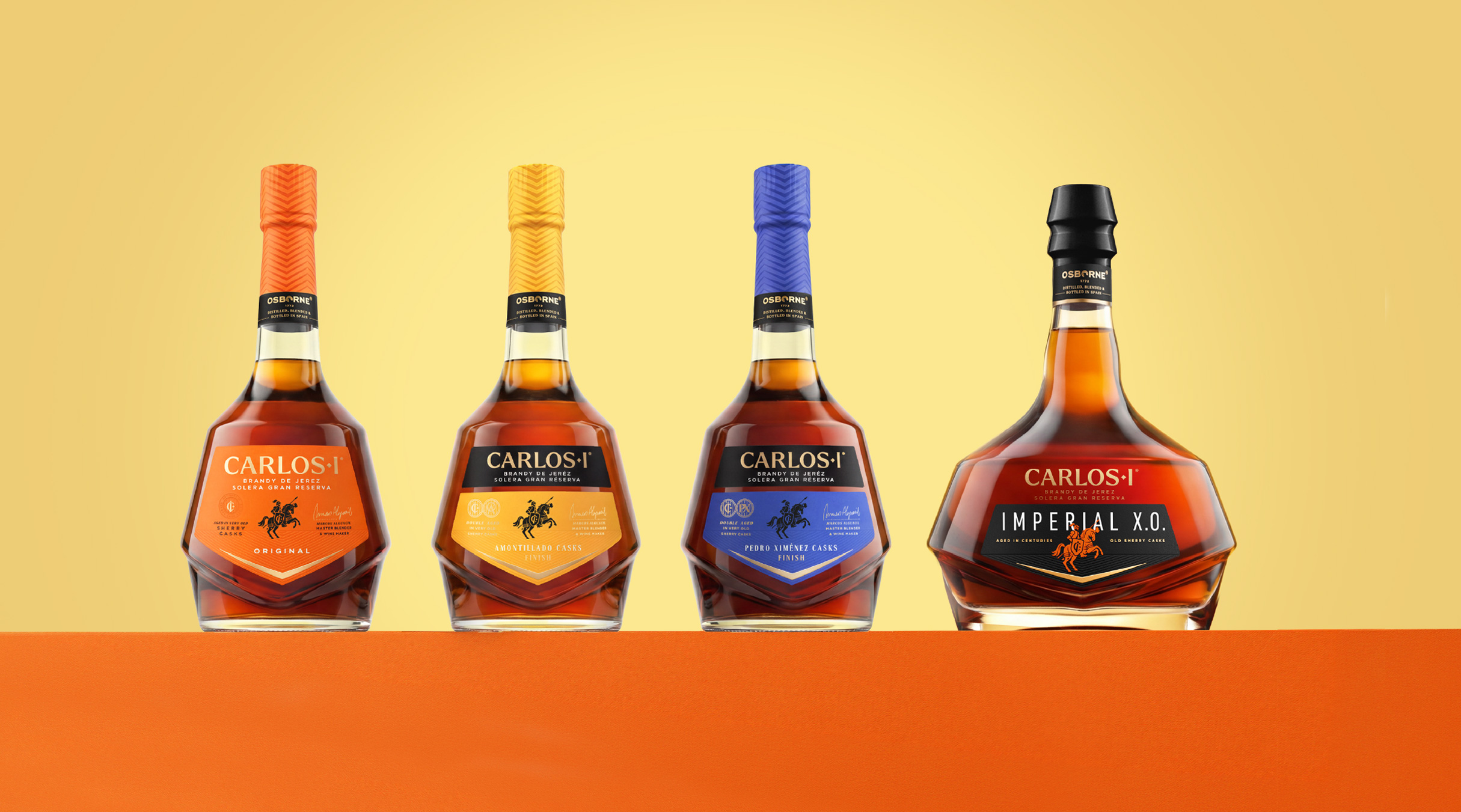
Across the range, this visual confidence is extended through bold colour coding, matching capsules, chevron textures, refined finishes, and a more disciplined hierarchy of information. Each expression gains clearer individuality, while the portfolio comes together as a stronger, more recognisable family.
The liquid credentials are no longer buried within the design. Solera Gran Reserva, sherry cask maturation, double aging, cask finish, Osborne expertise, and Spanish origin are brought into sharper focus, turning craftsmanship into a visible source of desire.
The result is a Carlos I that still feels historic, but no longer reserved. Still noble, but more charismatic. Still singular, but now impossible to overlook.
A spirit with the presence to match its name.
A Spanish icon with the courage to be seen.
Brand Redesign
Its name evokes stature. Its liquid speaks of depth. Its heritage is singular.
And yet, in an increasingly crowded premium spirits world, Carlos I had become more admired by those who knew it than noticed by those who did not. Its historical codes and prestige appeal were intact, but too discreet. Its authority was real, but visually contained.
The opportunity was not to make Carlos I louder for the sake of attention. It was to give a spirit with such a commanding name, origin, and character the courage to be fully seen.
Our ambition was to transform Carlos I from a brand of quiet gravitas into one of magnetic presence, without sacrificing the heritage that made it iconic.
The challenge was not reinvention, but revelation.
How could we make Carlos I feel more visible, more desirable, and more culturally alive, while preserving its royal symbolism, its Spanish identity, and the loyalty of those who already knew it? How could a brand rooted in legacy step forward with confidence, making more of its extraordinary assets without retreating into nostalgia?
Carlos I needed to assert itself in the broader world of prestige dark spirits, not by borrowing codes from elsewhere, but by amplifying its own. Its name, its knight, its sherry-cask story, its Jerez origin, and its deep amber character all had to become more immediate, more legible, and more iconic.
Across the portfolio, this meant building a clearer, bolder, more coherent visual system: one capable of holding stature at close range while commanding attention from afar.
At the heart of the work was a simple conviction: A spirit called Carlos I should never disappear into the shadows.
We created a design evolution that gives Carlos I a new visual confidence.
The redesign brings the brand forward. A larger, more assertive Carlos I wordmark occupies the centre of the bottle with renewed authority. The knight symbol becomes a stronger emblem of legacy and command through a fully redrawn illustration.
Most powerfully, colour becomes an act of visibility. The vivid orange of the core expression breaks decisively from the darker, more recessive language of the previous design. It catches the eye, radiates warmth, and gives physical form to the spirit’s intensity.
Across the range, this visual confidence is extended through bold colour coding, matching capsules, chevron textures, refined finishes, and a more disciplined hierarchy of information. Each expression gains clearer individuality, while the portfolio comes together as a stronger, more recognisable family.
The liquid credentials are no longer buried within the design. Solera Gran Reserva, sherry cask maturation, double aging, cask finish, Osborne expertise, and Spanish origin are brought into sharper focus, turning craftsmanship into a visible source of desire.
The result is a Carlos I that still feels historic, but no longer reserved. Still noble, but more charismatic. Still singular, but now impossible to overlook.
A spirit with the presence to match its name.
A Spanish icon with the courage to be seen.
Brand identity
Packaging
Close the full story
«Working with the team at Appartement 103 on the Carlos I redesign has been a masterclass in balancing heritage with modernity. Their sensitivity to the brand’s legacy, combined with a bold creative vision, has elevated the brand’s presence across the entire range with clarity and authority. Strong partnerships make all the difference, and this is a great example of what can be achieved when there’s true alignment on ambition and execution.»
Orlaith Whelan, Global Brand Manager
GRUPO OSBORNE
GRUPO OSBORNE