MARQUES DE CASA CONCHA
Brand redesign
For over 40 years, Marques de Casa Concha proudly epitomises what Chilean vineyards have best to offer to the world. We rejuvenated this flagship brand by working closely with Concha Y Toro group, enhancing its story and origin.
Read the full story
MARQUES DE CASA CONCHA
Brand redesign
Owned by giant Concha Y Toro group, Marques de Casa Concha debuted in 1976 and quickly positioned itself as a brand of extraordinary quality, acknowledged for its royal heritage and tradition.
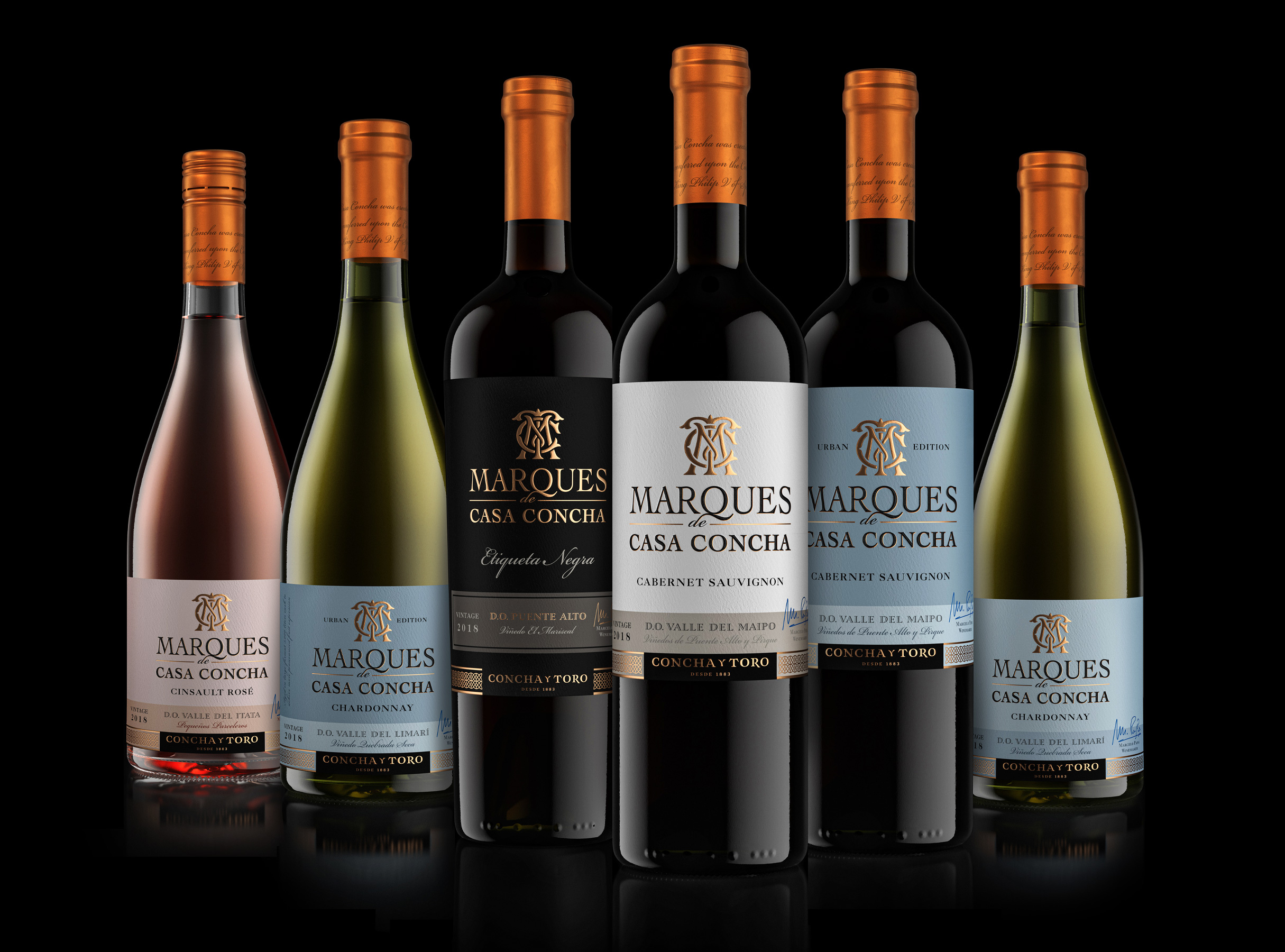
Following renowned winemaker Marcelo Papa's years of hard work, the brand stands today as one of the most iconic premium range of wines from Chile, consisting of 11 varietals exported to over 100 countries, with the ultimate goal to present to the world the best that Chileans vineyards have to offer.
We were honoured to embark on this journey to redesign this remarkable brand, staging it for future development.
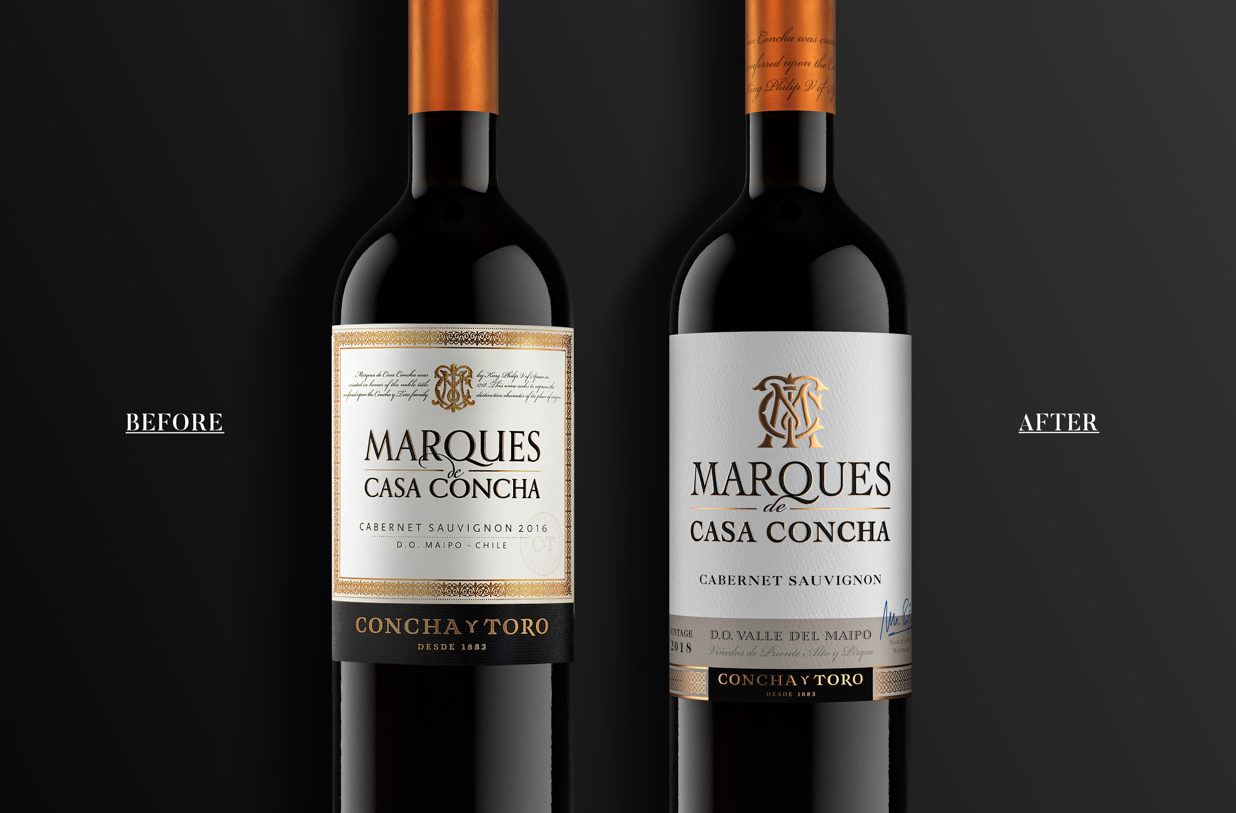
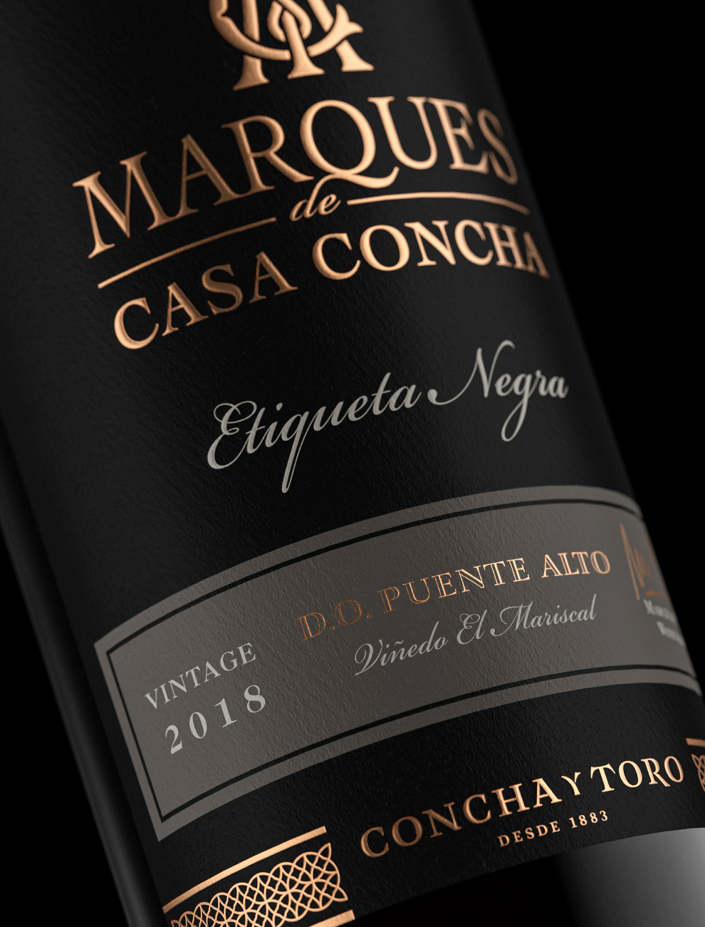
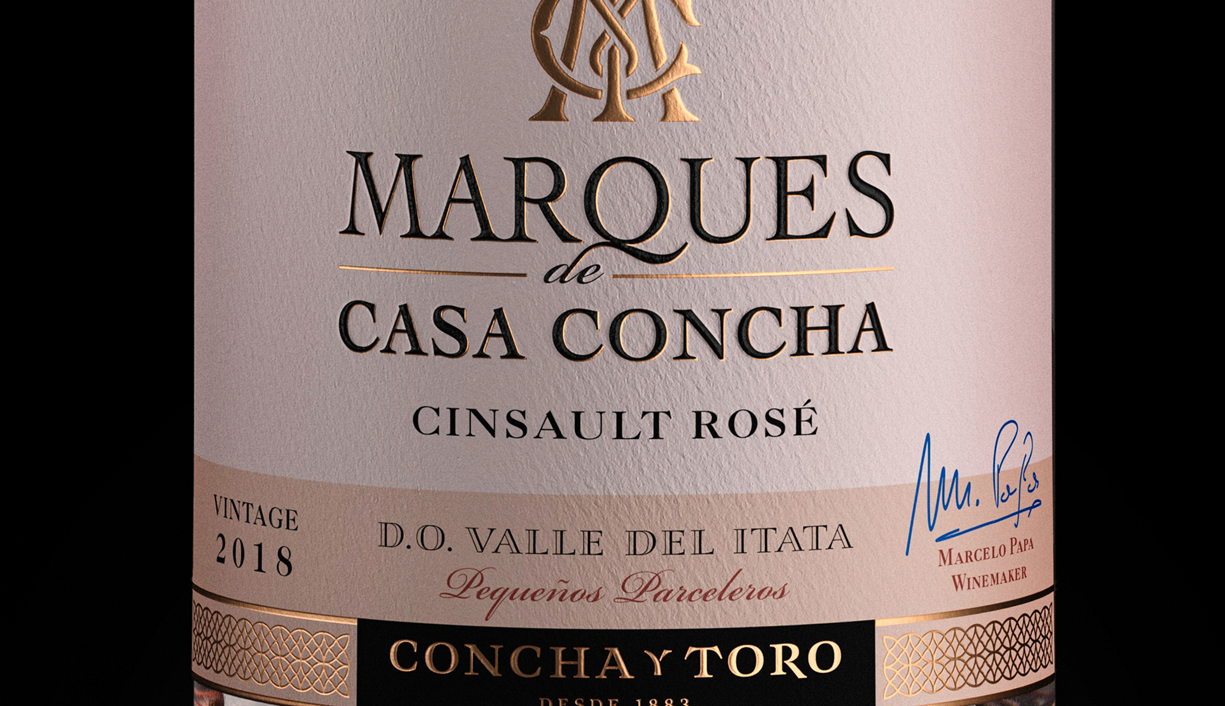
With such strong brand awareness, we defined our key design challenges through three main elements: 1/ Respecting the brand visual assets and 40 years of heritage, maintaining recognition. 2/ Elevating the label impact and visibility on the shelf with a more modern and desirable presentation. 3/ Enhancing each SKU region and origin as a true point of differentiation from competitors.
With our objectives defined, every single element of the labels was revamped with accuracy.
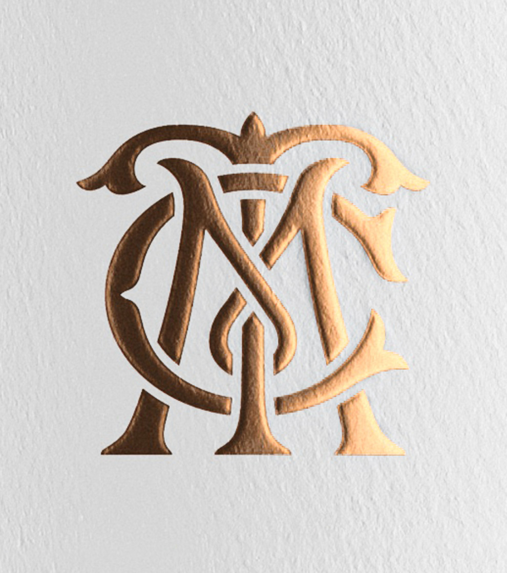
From the monogram to the brand wordmark, we created a unique and bold brand panel with a sharper and unique look and feel.
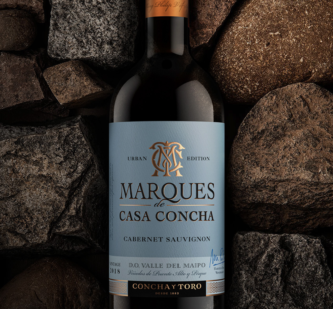
The bespoke patterns were inspired by the ornaments found in the winery, created and implemented in all labels to increase unicity across the range.
The colours for each variant were made more prominent, creating differentiation across the varietals and terroirs.
Furthermore, a more natural textured paper, copper foil detailing, embossing, and debossing finishings have been injected into the presentation, boasting naturality and craftsmanship.
Brand redesign
Owned by giant Concha Y Toro group, Marques de Casa Concha debuted in 1976 and quickly positioned itself as a brand of extraordinary quality, acknowledged for its royal heritage and tradition.
Following renowned winemaker Marcelo Papa's years of hard work, the brand stands today as one of the most iconic premium range of wines from Chile, consisting of 11 varietals exported to over 100 countries, with the ultimate goal to present to the world the best that Chileans vineyards have to offer.
We were honoured to embark on this journey to redesign this remarkable brand, staging it for future development.
With such strong brand awareness, we defined our key design challenges through three main elements: 1/ Respecting the brand visual assets and 40 years of heritage, maintaining recognition. 2/ Elevating the label impact and visibility on the shelf with a more modern and desirable presentation. 3/ Enhancing each SKU region and origin as a true point of differentiation from competitors.
With our objectives defined, every single element of the labels was revamped with accuracy.
From the monogram to the brand wordmark, we created a unique and bold brand panel with a sharper and unique look and feel.
The bespoke patterns were inspired by the ornaments found in the winery, created and implemented in all labels to increase unicity across the range.
The colours for each variant were made more prominent, creating differentiation across the varietals and terroirs.
Furthermore, a more natural textured paper, copper foil detailing, embossing, and debossing finishings have been injected into the presentation, boasting naturality and craftsmanship.
Brand identity
Packagings
Close the full story
“Working with Appartement 103 was a great experience. Despite the distance and the Covid crisis that had just started, they worked closely and managed to capture the essence of our historical brand. The work was efficient, well-timed and there was sureness in the design proposals through spectacular work. This new brand presentation adds a lot of value to Marques de Casa Concha.”
Isabel Guilisasti - VP of Fine Wines & Corporate Image - Concha y Toro