CARDENAL MENDOZA
Brand redesign
Cardenal Mendoza has, since 1887, expanded across the world, becoming one of the noblest brandies produced in the region of Jerez de la Fronteira in Spain. While keeping the brand cues, we fully revamped the brand from top to bottom.
Read the full story
CARDENAL MENDOZA
Brand redesign
Founded in 1887, the owners of Sanchez Romate Hermanos started to craft a unique, different brandy for their own consumption. Following their commitment in quality, craftsmanship and expertise in brandy production, Cardenal Mendoza has, since then, expanded across the world, becoming one of the noblest brandies produced in the region of Jerez de la Fronteira in Spain.
Working on such traditional brand, we had to focus on two main objectives: Redesigning a fresh perspective to the brand, elevating its personality and uniqueness to get noticed by a new generation of drinkers while, on the other hand, we had to maintain strong brand recognition, not alienating current consumers in love with its traditional values and heritage.
Following an immersive visit to their house in South Spain, our team got to know the brand from its core. Cardenal Mendoza Clásico is an exceptional Brandy de Jerez, aged for an average of 15 years in Oloroso and Pedro Ximénez Sherry Wine casks in the traditional system known as soleras and criaderas.
We were fascinated by their ageing facilities; the darkened environment evoked this unique feeling of being in a Cathedral where time seems to have frozen centuries ago. The precise control of light touching the barrels is key to the ageing process, allowing the product to mature into its best version. It turned the visit into a reflective experience leveraged by this mystical place, enabling oneself to connect with its inner self.
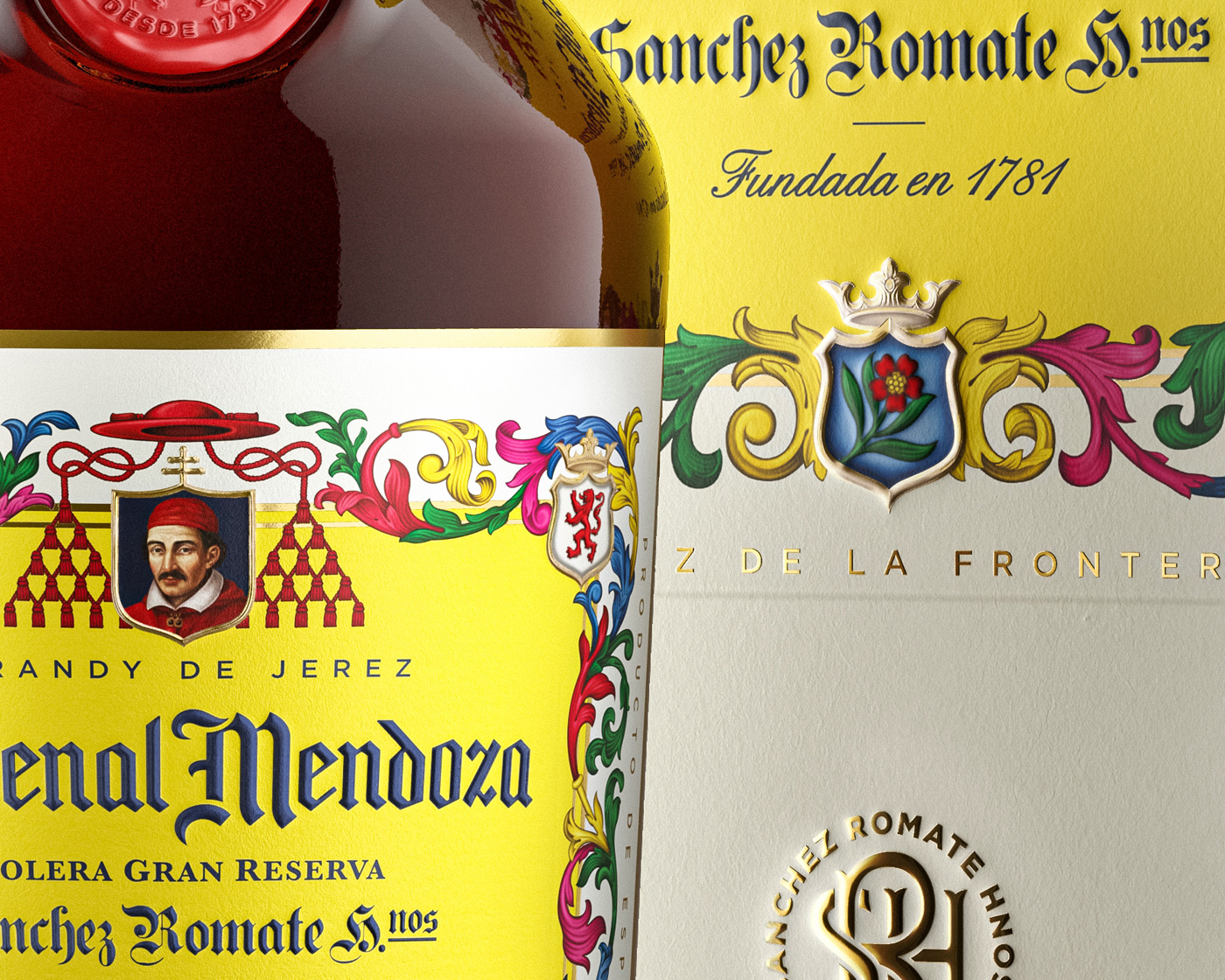
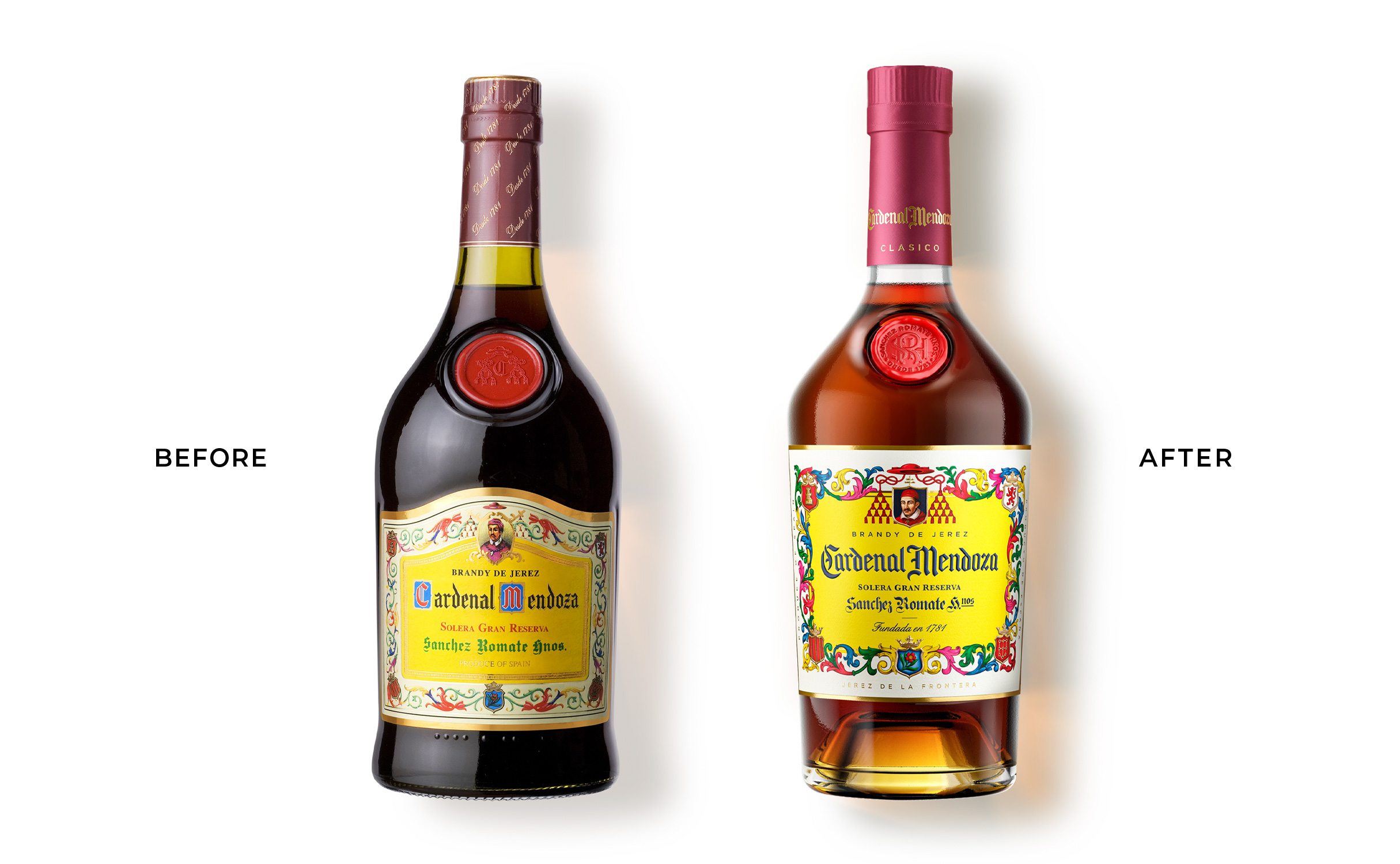
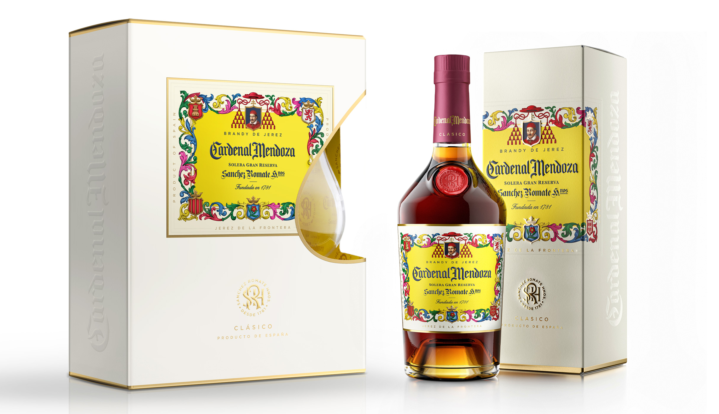
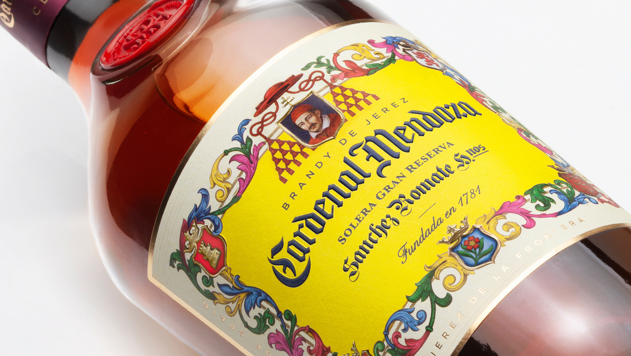
The project deliverables consisted of bottle structural design and graphic design rejuvenation for both primary and secondary packs. While keeping the brand cues and label hierarchy intact, we redesigned all elements including the colourful swirls that we brought to the forefront of the presentation, pushing the unexpected colour combination even further, creating unicity, strong character and a modern look.
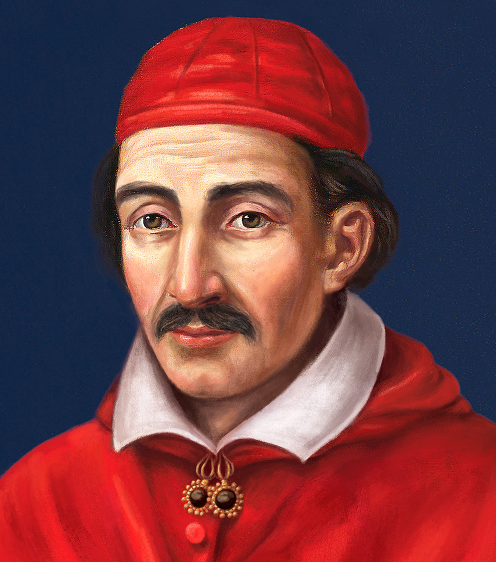
We made the proprietary yellow colour fresher, enhancing vibrancy and visual impact. Simultaneously, the Cardenal illustration was digitally redrawn, keeping the antique feeling and texture of an authentic oil painting.
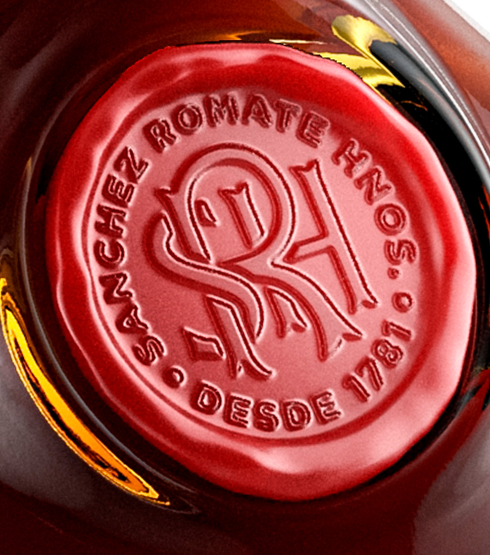
Moving away from the bottle's original soft contour, our team revamped its shape to convey a more confident character to the overall design. The shoulders are higher and sharper, while we integrated the redesigned wax seal into a recess that perfectly embodies the bottle. The deep punt finalises the shape and adds a sense of elegance.
This project depicts the perfect case of a brand rejuvenation challenge. It required a delicate balance between maintaining its essence and heritage intact; while providing a fresh perspective to the brand, standing out in such a crowded environment. It set the groundwork for future growth and expansion of the brand's portfolio.
Brand identity
Packagings
Bottle structural design
Close the full story
“We're absolutely delighted with the upgraded identity, packaging and bottle redesigned by Appartement 103 for our century-old brand. Their team's creativity, vision accuracy and technical knowledge are impressive. Without their special sensitivity to understand our brand, this challenge would have been impossible. They are simply The agency to work with!”
Francisco Requejo - CEO - Sanchez Romate Hermanos'
