MUMM
Brand Redesign
Since 1876, G.H. Mumm has embodied French celebration and elegance, instantly recognized by its red ribbon inspired by the Légion d’Honneur.
Through many evolutions, the Maison’s bold spirit has remained. Eight years after its last major change, we guided the brand to return to fundamentals, not out of nostalgia, but out of fidelity to its legacy and to consumers who have always valued its original style.
Through many evolutions, the Maison’s bold spirit has remained. Eight years after its last major change, we guided the brand to return to fundamentals, not out of nostalgia, but out of fidelity to its legacy and to consumers who have always valued its original style.
Read the full story
Mumm
Brand Redesign
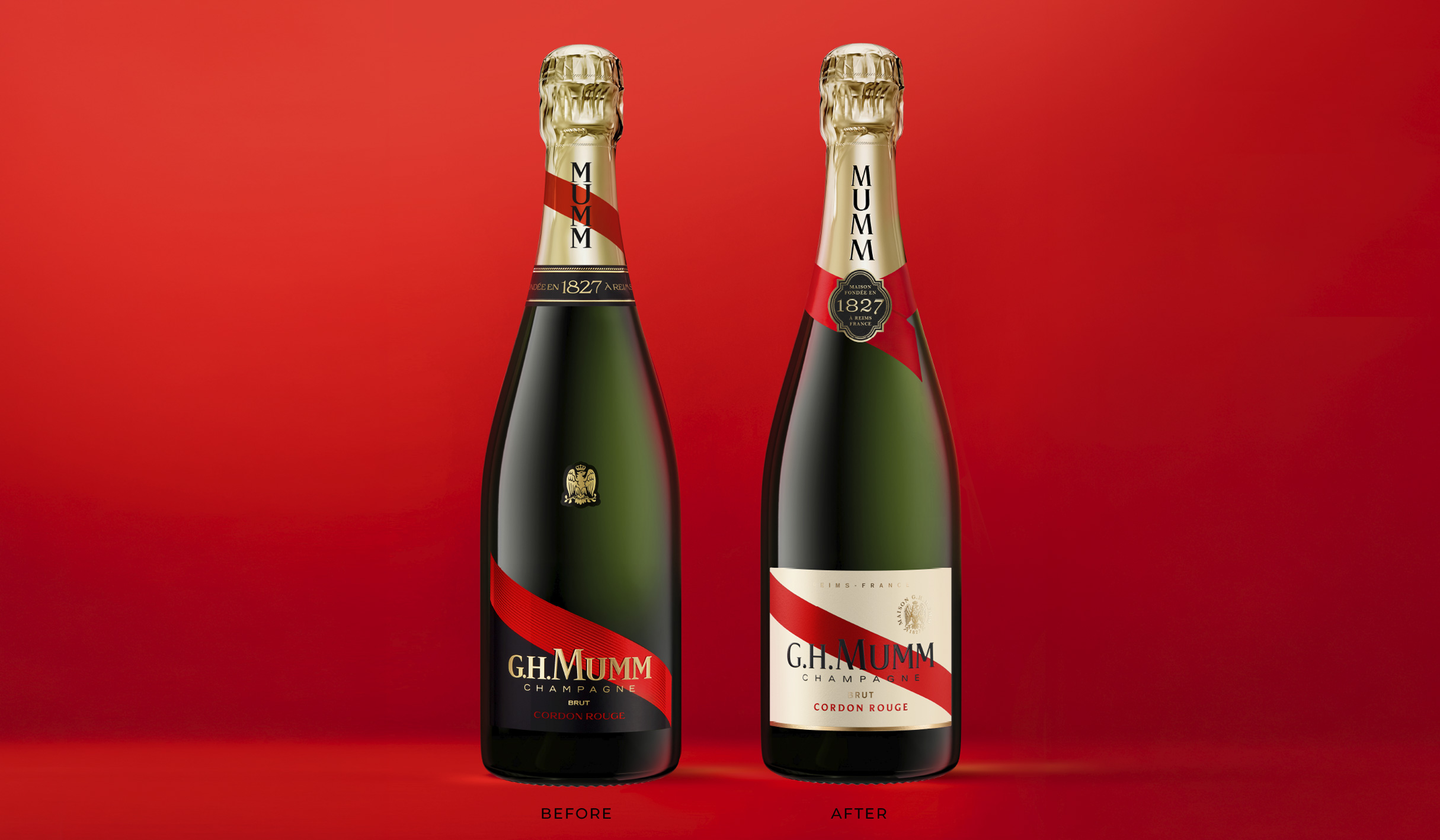
In 2025, Cordon Rouge reclaims its historic visual codes through a refined reinterpretation drawn from the archives, where our team unearthed graphical treasures to inform a faithful, contemporary brand and packaging identity.
As the Champagne category keeps on moving further into ultra-premium territory, G.H. Mumm undertook a global transformation to elevate luxury cues and distinctiveness.
Perceptions had drifted: the brand felt less premium than key competitors, with an identity short on consistency and clarity.
With Cordon Rouge Brut reinstated as the hero cuvée, our task was to rebuild an emblem that conveys forward-thinking spirit, commitment to excellence, and two centuries of savoir-faire. In short, to give meaning back to Cordon Rouge! We set out to sharpen posture, reinforce leadership, and restore purpose to every detail by refining identity, materials and printing, clarifying message hierarchy, and bringing new life and elegance to the ribbon, Mumm’s most powerful asset.
Everything evolved, yet the brand feels closer to its origins than ever.
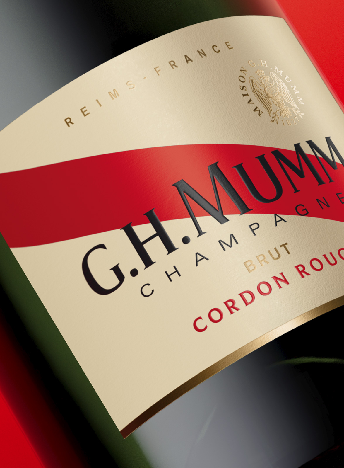
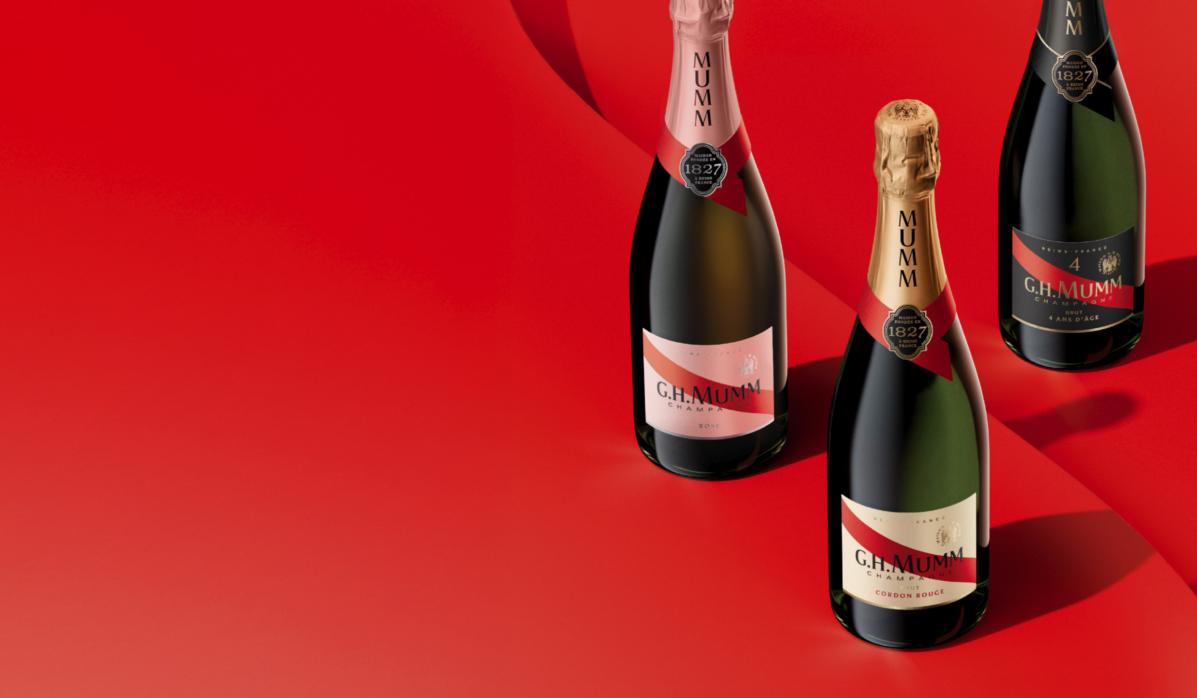
We reintroduced the cream label for immediate heritage cues, freshness, and strong readability.
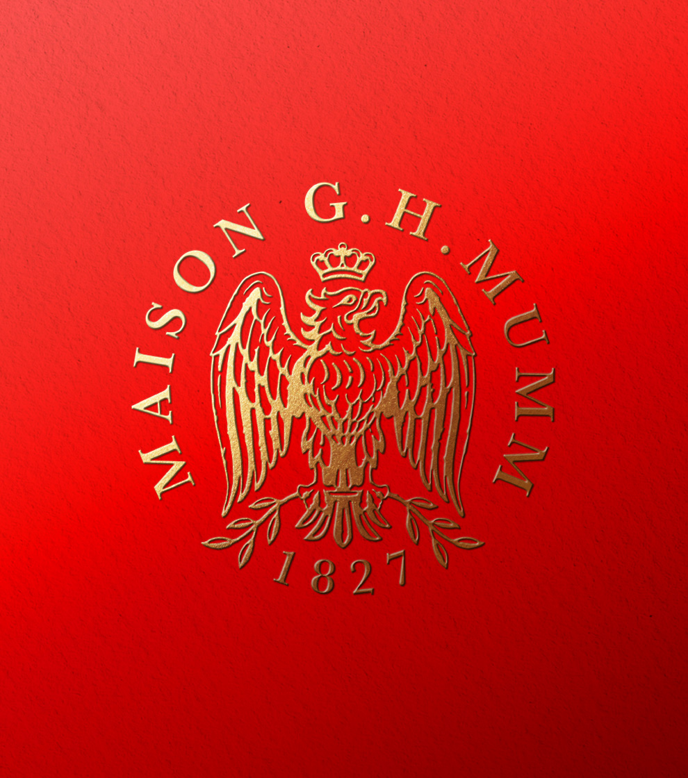
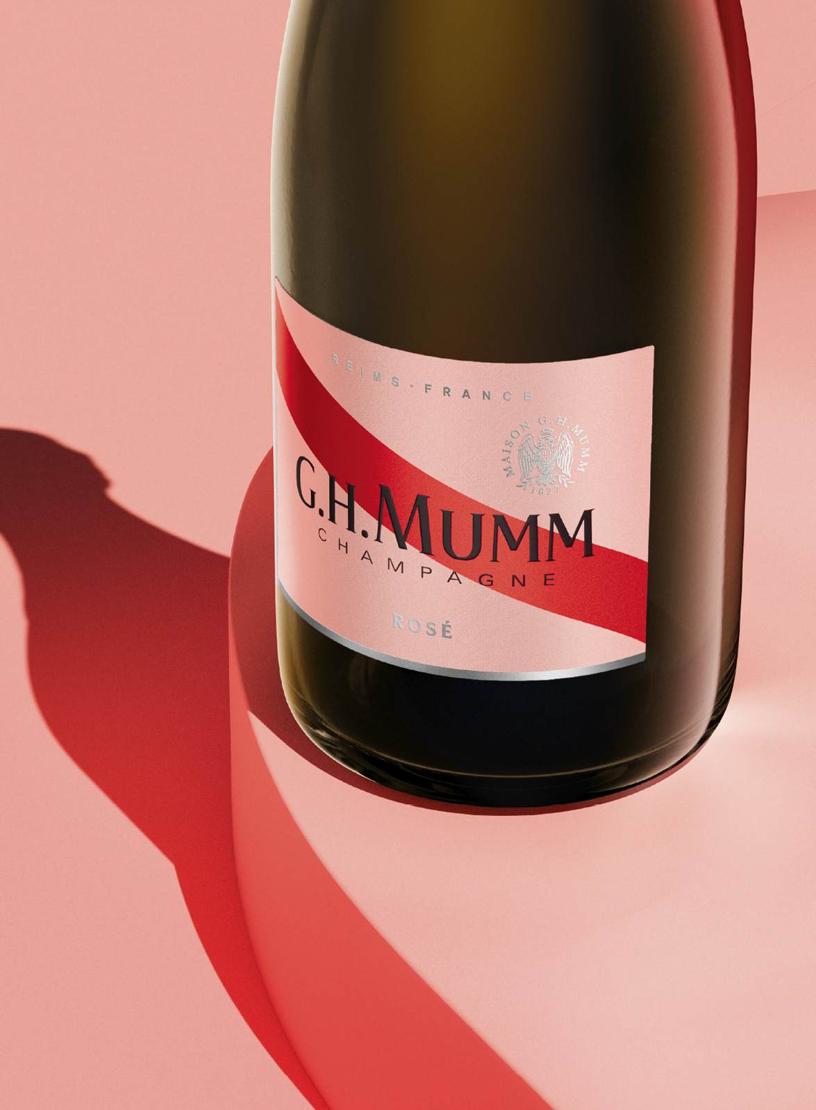
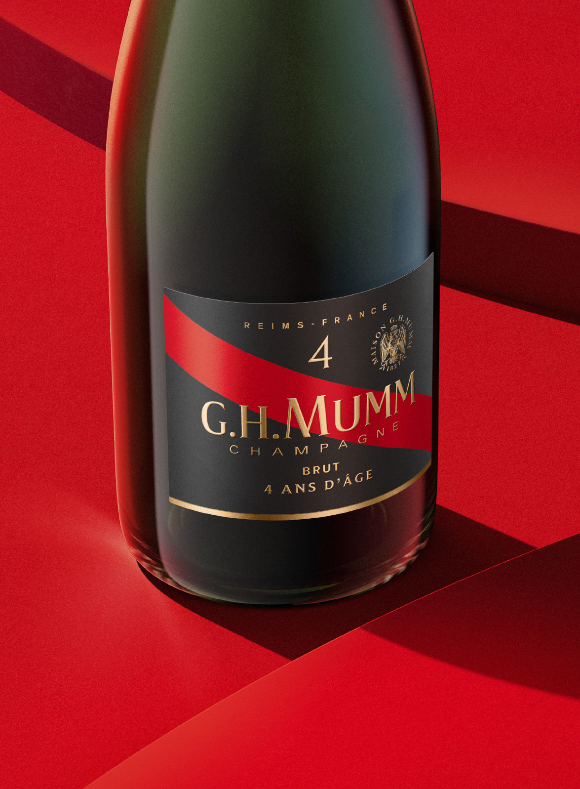
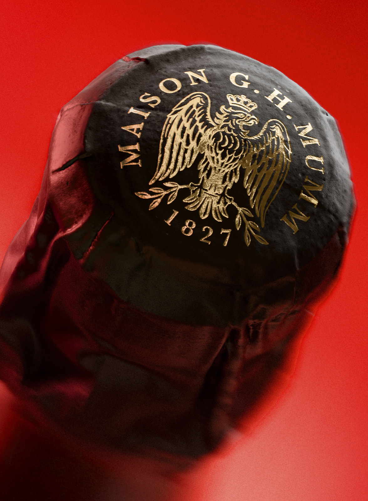
At the center, the red silk sash returns with contemporary proportions and finishes, regaining narrative power on shelf. The historic eagle has been fully redrawn for elegance and tradition, now expressed as an embossed golden seal that strengthens luxury signals and anchors authenticity. The founding medallion appears on the cravate as a visible mark of quality. Materials, finishes, and print have been re-orchestrated to enhance light, texture, and depth, while information architecture is clarified across each SKUs.
Typography also plays a defining role. The G.H. Mumm typeface has been updated from archival letterforms we refined, injecting modernity and poise, with a distinctive “M” echoing the ribbon’s gesture.
Premium, distinctive, and deeply rooted in its lineage, the new G.H. Mumm identity amplifies its timeless DNA with confidence, reasserting the Maison at the heart of the ultra-premium Champagne segment.
Brand Redesign
In 2025, Cordon Rouge reclaims its historic visual codes through a refined reinterpretation drawn from the archives, where our team unearthed graphical treasures to inform a faithful, contemporary brand and packaging identity.
As the Champagne category keeps on moving further into ultra-premium territory, G.H. Mumm undertook a global transformation to elevate luxury cues and distinctiveness.
Perceptions had drifted: the brand felt less premium than key competitors, with an identity short on consistency and clarity.
With Cordon Rouge Brut reinstated as the hero cuvée, our task was to rebuild an emblem that conveys forward-thinking spirit, commitment to excellence, and two centuries of savoir-faire. In short, to give meaning back to Cordon Rouge! We set out to sharpen posture, reinforce leadership, and restore purpose to every detail by refining identity, materials and printing, clarifying message hierarchy, and bringing new life and elegance to the ribbon, Mumm’s most powerful asset.
Everything evolved, yet the brand feels closer to its origins than ever.
We reintroduced the cream label for immediate heritage cues, freshness, and strong readability.
At the center, the red silk sash returns with contemporary proportions and finishes, regaining narrative power on shelf. The historic eagle has been fully redrawn for elegance and tradition, now expressed as an embossed golden seal that strengthens luxury signals and anchors authenticity. The founding medallion appears on the cravate as a visible mark of quality. Materials, finishes, and print have been re-orchestrated to enhance light, texture, and depth, while information architecture is clarified across each SKUs.
Typography also plays a defining role. The G.H. Mumm typeface has been updated from archival letterforms we refined, injecting modernity and poise, with a distinctive “M” echoing the ribbon’s gesture.
Premium, distinctive, and deeply rooted in its lineage, the new G.H. Mumm identity amplifies its timeless DNA with confidence, reasserting the Maison at the heart of the ultra-premium Champagne segment.
Brand identity
Packaging
Close the full story
"Appartement 103 has a rare combination of artistic flair and sharp brand
understanding. They take the time to challenge, fully understand the brief and they strive for excellence in their work. It’s precious to have such allies when
working on luxury brands, where each small detail matters."
understanding. They take the time to challenge, fully understand the brief and they strive for excellence in their work. It’s precious to have such allies when
working on luxury brands, where each small detail matters."
Marie de Vries, Marketing Director Champagne MMPJ
PERNOD RICARD
PERNOD RICARD