BOTRAN
Brand redesign
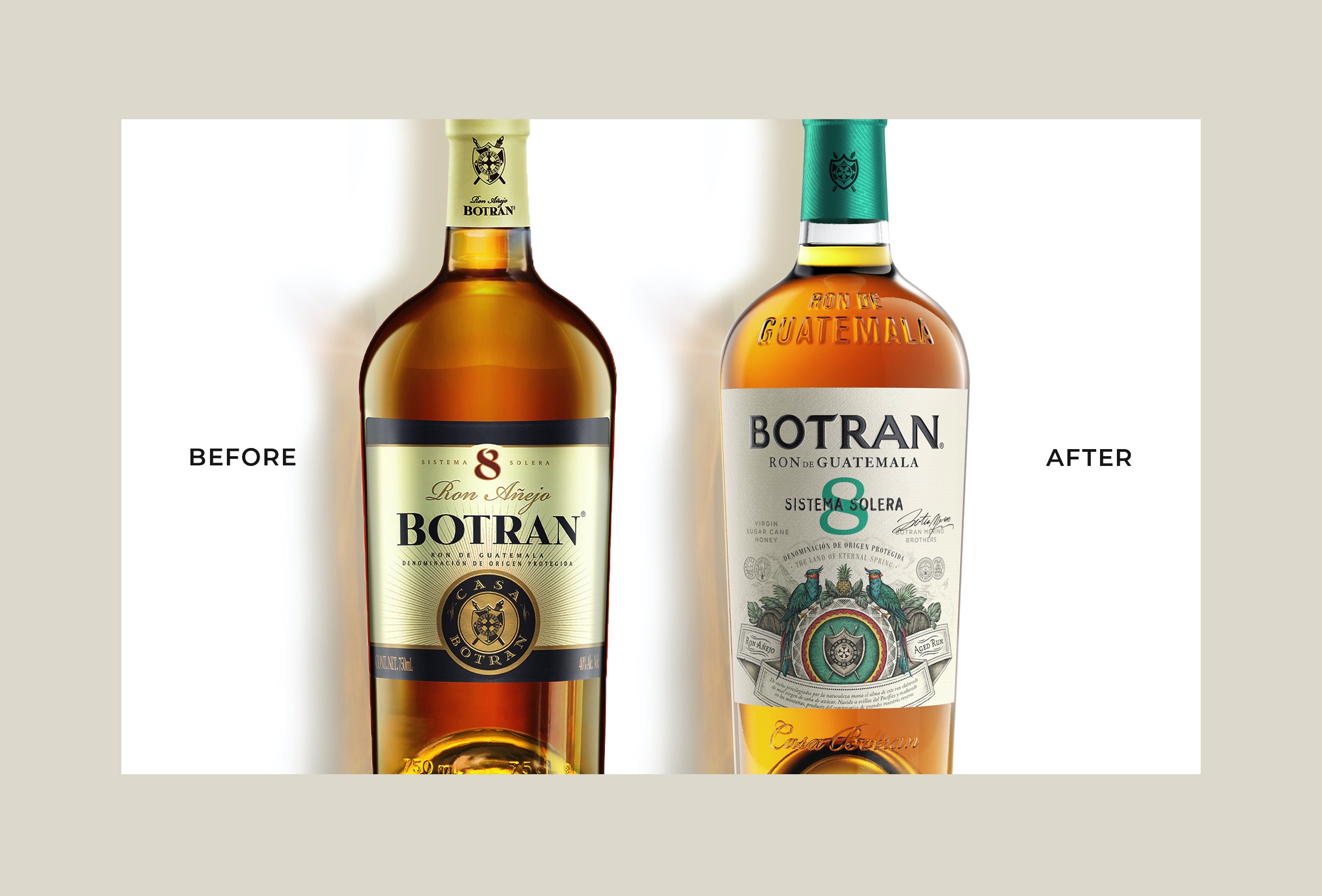
Guatemala is an enchanting land where mother nature dictates her rules through its 23 volcanos! Also known as the land of eternal spring, we connected the dots through a new brand strategy, packaging graphic design as well as portfolio management.
Read the full story
BOTRAN
Brand redesign
The journey started with a magical visit to Guatemala, from discovering Casa Botran ageing facilities, sugar cane fields, distillery, to Guatemaltec cultural places, genuinely immersing ourselves into the DNA of the brand and its surroundings.
We were stunned by the natural beauty of the country and the central influence of mother nature. With many active volcanos, it still has fertile soils and riches that provide the perfect environment to cultivate the highest quality sugar cane.
Following 6 generations of Botran-Merino family's know-how, Botran has built, year after year, a sustainable production process with an obsession for quality; committed to reducing its environmental impact and giving back to nature.
The result of our collaboration is a stunning work of art that immediately invites consumers into a journey to discover the dreamland of Botran.
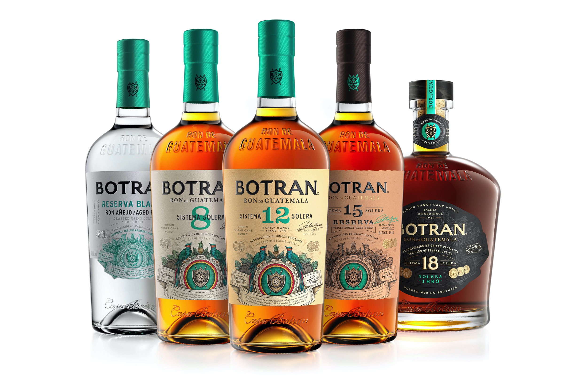
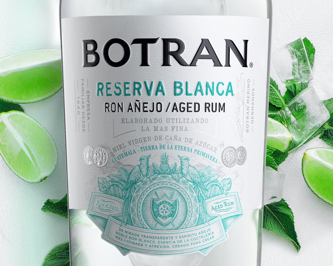
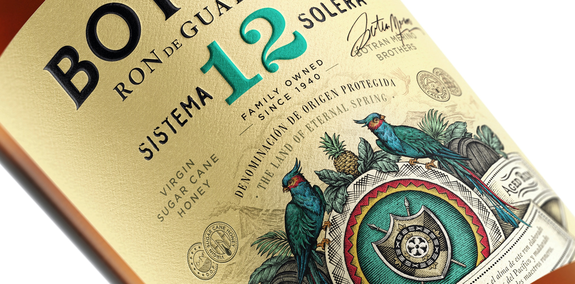
We created a powerful illustrative work highlighting the influence of nature on the Rum production, becoming the focal elements of the packaging and acting as a focal point for enhanced brand recognition on shelf. Moreover, we introduced a proprietary green turquoise colour coming from the national Ketzal bird, that distinguishes the brand and expresses the vibrancy of the country.
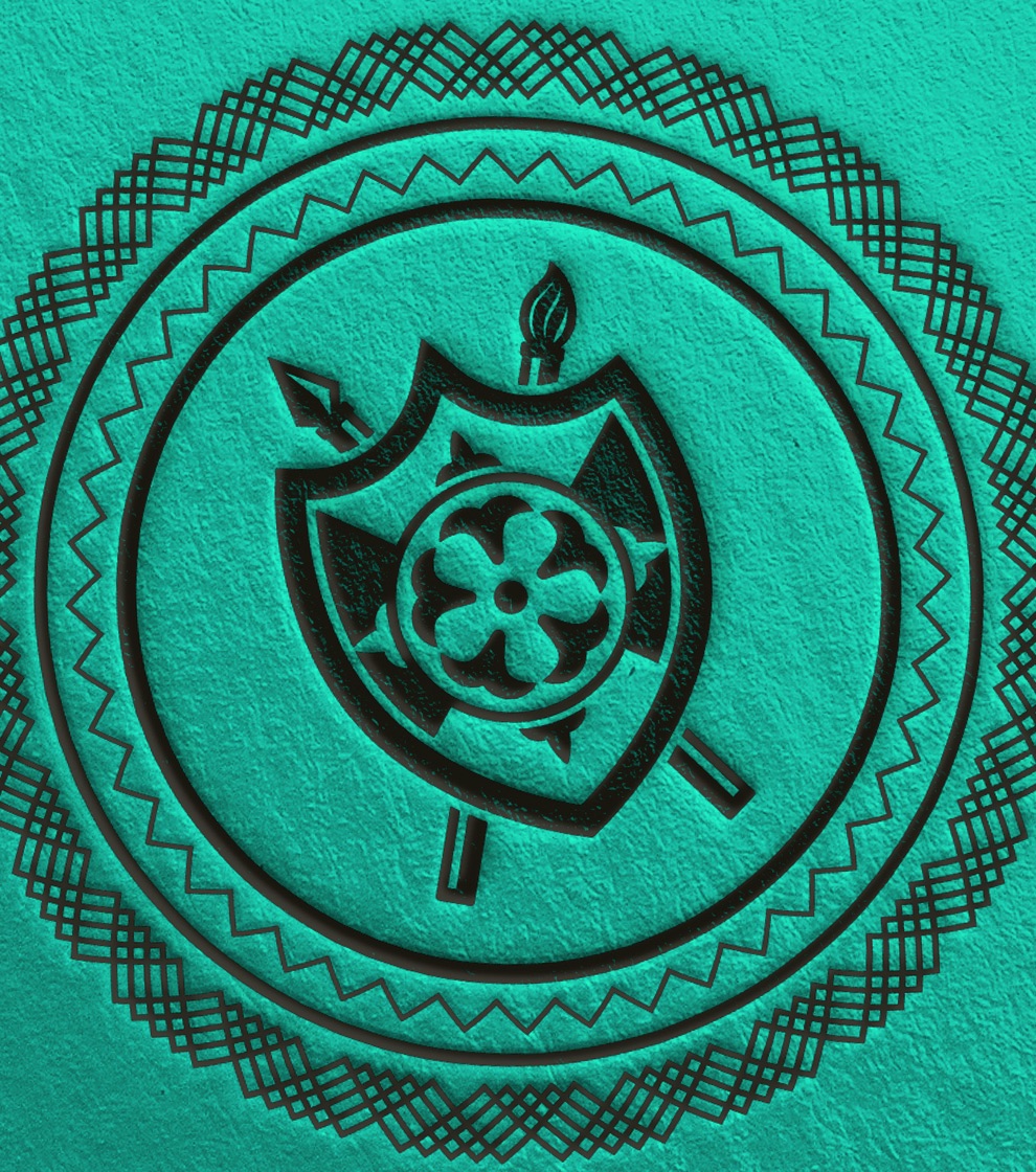
From the family crest, the logo typeface and all other intertwining graphical elements, we completely redesigned the brand to give more personality and boldness, while staying true to its essence.
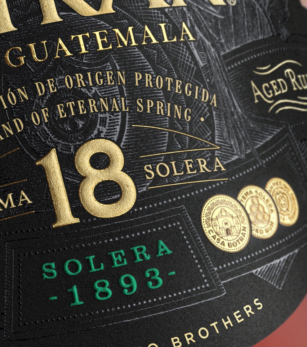
The portfolio premiumisation was enhanced through a play of materials, printing techniques and colours, adding a touch of premiumness as the portfolio goes up.
Brand strategy
Structural design
Brand identity
Packaging
Collateral
Close the full story
“Our experience with Appartment 103 was a fantastic rebranding journey that brought to life the vibrant spirit of Guatemala into the country’s favorite aged rum: Botran”
Ivan Valdez - Global Marketing Manager - Botran
