VANA TALLINN
Brand redesign & NPD
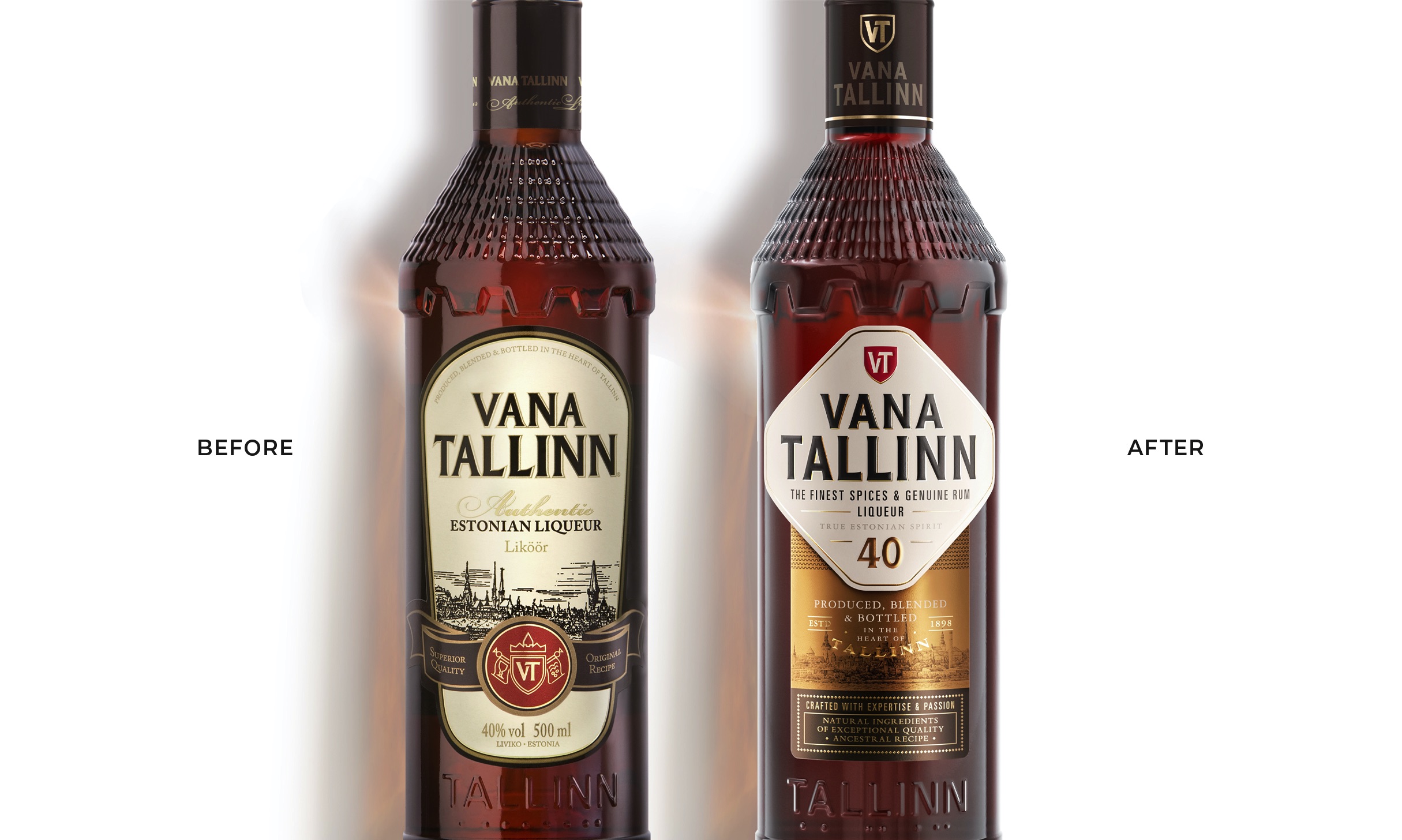
Vana Tallinn is the number one spirit in Estonia, it represents the deep-rooted culture of the country. Suffering from an outdated image, the brand required a new identity to seduce a new generation of drinkers and also stage the brand to compete against international competitors.
Read the full story
VANA TALLINN
Brand redesign & NPD
Vana Tallinn has been consistently increasing its popularity in foreign markets, competing with international brands. However, with an outdated presentation, it needed to inject fresh blood to keep growing and perpetuate.
How to strongly revamp a national icon without losing its essence?
Together with Vana Tallinn's team, we dug deep into the brand and country history to unlock its true potential with market relevance.
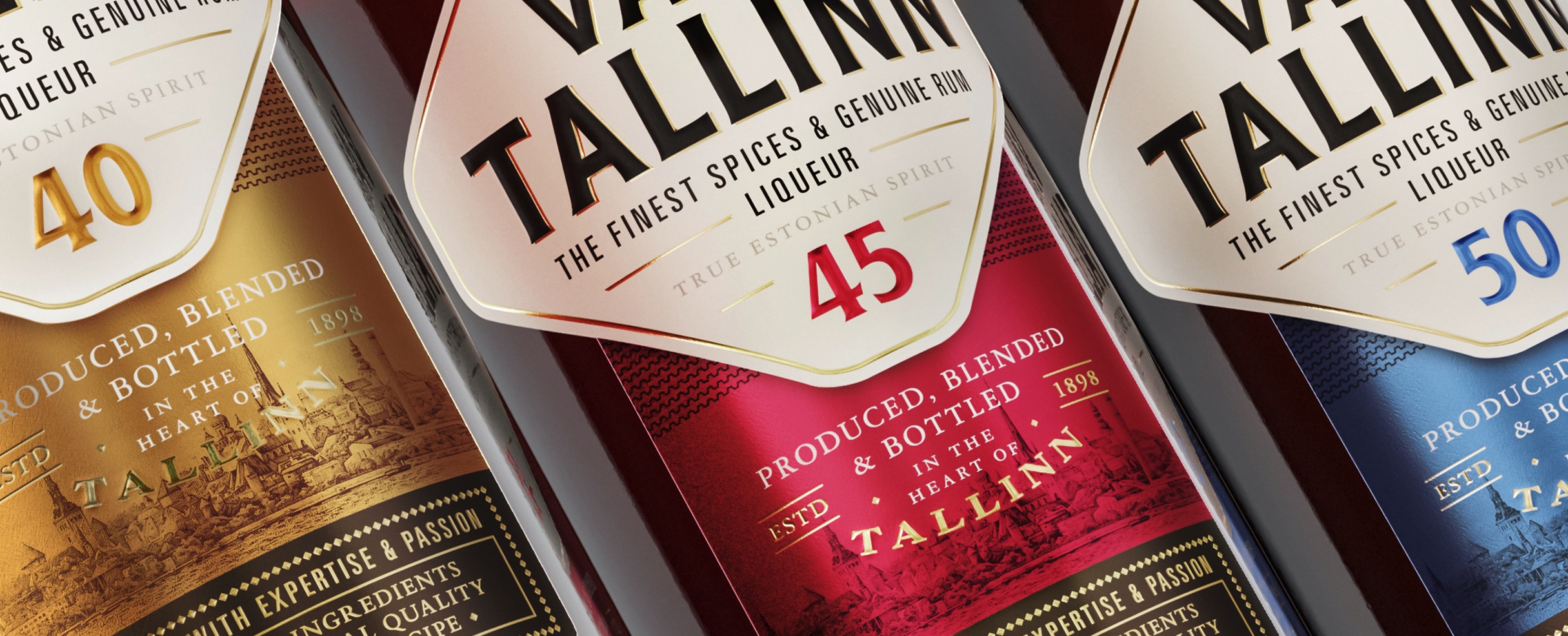
The final design was divided into two segments, the top unified lozenge label shape refers to the defence walls of the old city of Tallinn. It adds strength and boldness to the presentation while acting as a strong focal point that keeps the brand logo intact and visible across the range.
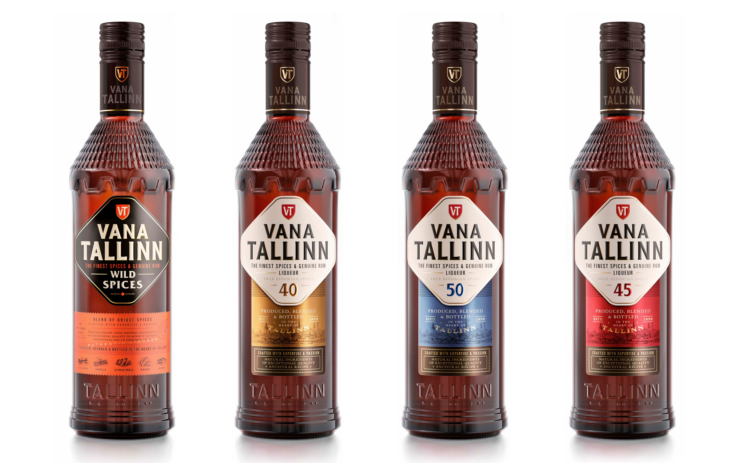
We created colour consistency across the core range to enhance visibility and brand recognition on the shelf. At the same time, the enlarged 40, 45 and 50 numbers improved differentiation for each variant as their sub-names.
The Vana Tallinn's typeface was refined to convey a more modern and confident stature, while the icon has been cleaned up and placed above 'Vana Tallinn' to re-enforcing the brand panel.
The bottom part of the label highlights the heritage, quality and craftsmanship of each product through a carefully selected metalised paper, showcasing the old city of Tallinn where the liqueur is still produced nowadays.
Following the core range rebranding, we created their first new product extension, VT Wild Spices. Through its iconic brand panel, the top part of the label presentation ensures impact and family recognition. The bottom label elegantly highlights the craftsmanship and essence of the new product, showcasing the carefully selected spices through a play of typefaces and hand-drawn illustrations.
Brand redesign & NPD
Vana Tallinn has been consistently increasing its popularity in foreign markets, competing with international brands. However, with an outdated presentation, it needed to inject fresh blood to keep growing and perpetuate.
How to strongly revamp a national icon without losing its essence?
Together with Vana Tallinn's team, we dug deep into the brand and country history to unlock its true potential with market relevance.
The final design was divided into two segments, the top unified lozenge label shape refers to the defence walls of the old city of Tallinn. It adds strength and boldness to the presentation while acting as a strong focal point that keeps the brand logo intact and visible across the range.
We created colour consistency across the core range to enhance visibility and brand recognition on the shelf. At the same time, the enlarged 40, 45 and 50 numbers improved differentiation for each variant as their sub-names.
The Vana Tallinn's typeface was refined to convey a more modern and confident stature, while the icon has been cleaned up and placed above 'Vana Tallinn' to re-enforcing the brand panel.
The bottom part of the label highlights the heritage, quality and craftsmanship of each product through a carefully selected metalised paper, showcasing the old city of Tallinn where the liqueur is still produced nowadays.
Following the core range rebranding, we created their first new product extension, VT Wild Spices. Through its iconic brand panel, the top part of the label presentation ensures impact and family recognition. The bottom label elegantly highlights the craftsmanship and essence of the new product, showcasing the carefully selected spices through a play of typefaces and hand-drawn illustrations.
Brand strategy
Brand identity
Packaging
Close the full story
“Looking at the new design and first market feedback, it is spot on for Vana Tallinn!
Appartement’s 103 team was professional, friendly, quick and guiding. Great hands-on approach and amazing portfolio with plenty of experience to be the backbone.”
Appartement’s 103 team was professional, friendly, quick and guiding. Great hands-on approach and amazing portfolio with plenty of experience to be the backbone.”
Anna-Kai Tors - Marketing Manager - Liviko Group