CHÂTEAU DE POMMARD
Brand redesign
Repositioning an iconic 300 years old Burgundy wine estate with relevance is no small task. We were honoured to embark on this fabulous journey to reveal, at its peak, the magic of our most traditional French terroir with an innovative yet crafted vision.
Read the full story
CHÂTEAU DE POMMARD
Brand redesign
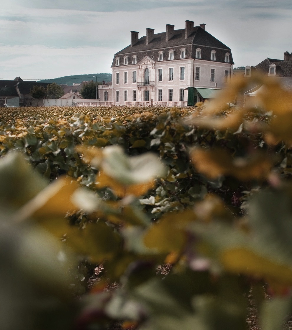
Since 1726, Château de Pommard remains one of the most iconic wine estates in Burgundy.
It was bought in 2014 by Michael Baum, a Californian entrepreneur, being the fifth family to steward the domain in almost three centuries. Their commitment and vision brought new sustainable practices to the estate's winemaking and viticulture, sharing the beauty of Burgundy with the world in new and innovative ways.
Château de Pommard had everything in its roots to become a top luxury brand backboned by its incredible heritage, deep savoir-faire & original story.
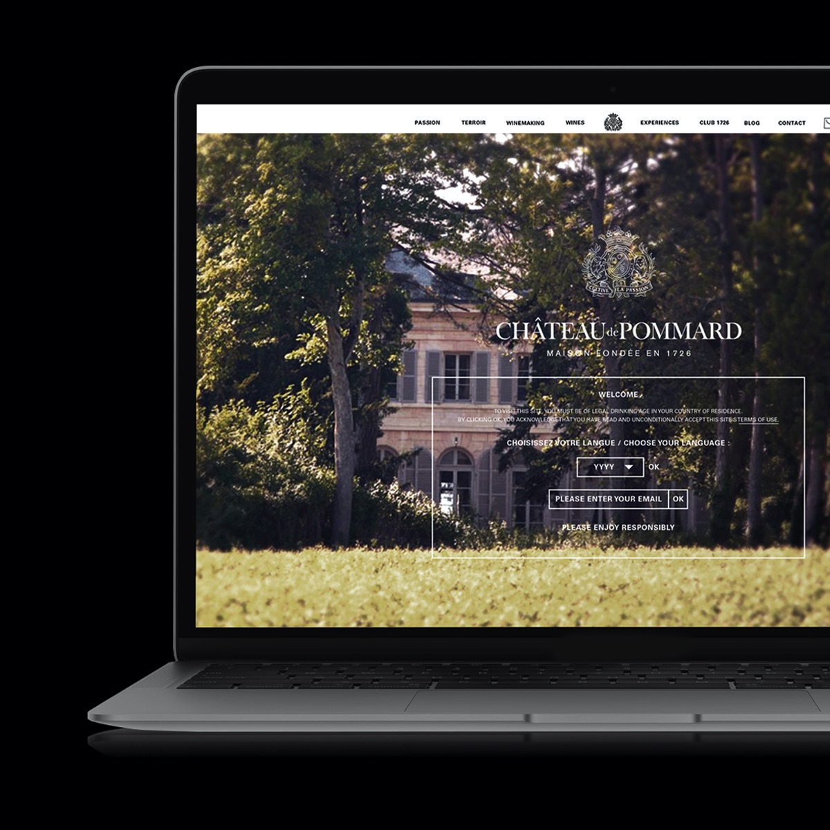
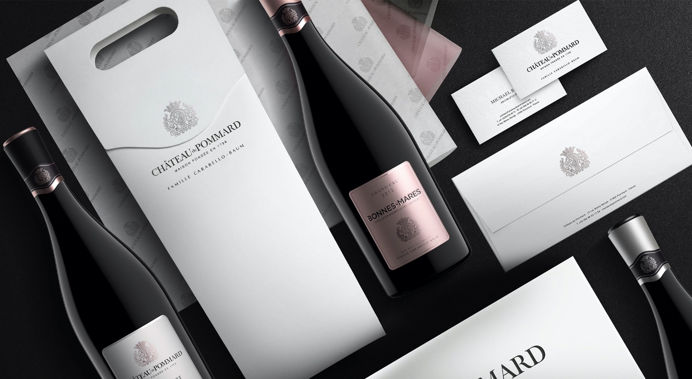
Starting with the development of an exciting brand platform, we expended our expertise onto the packaging design, bottle structural design, as well as the Chateau's communication collaterals.
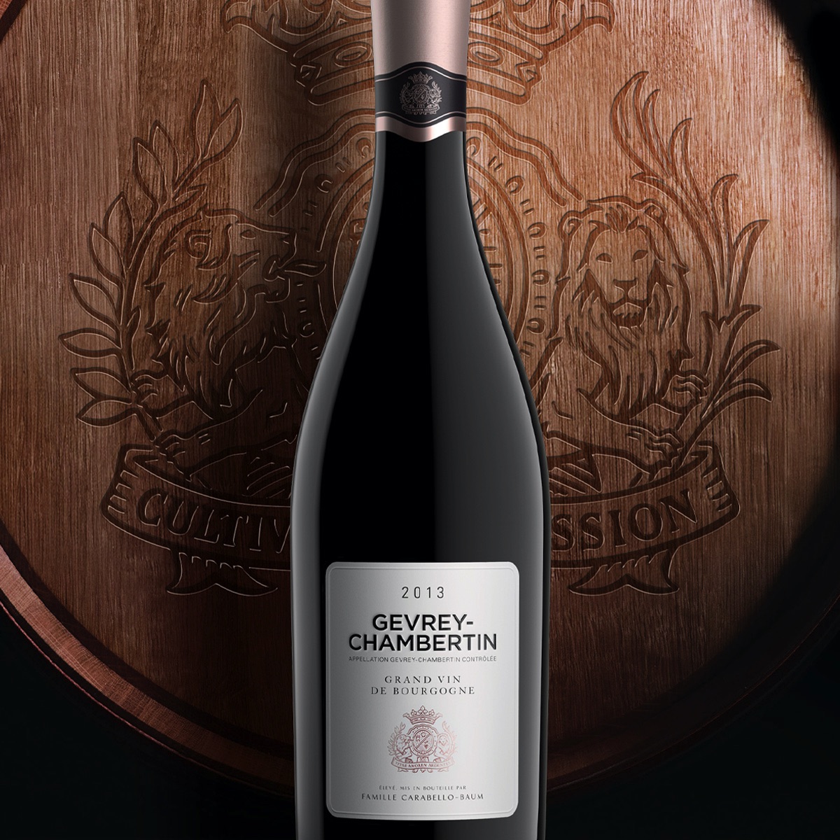
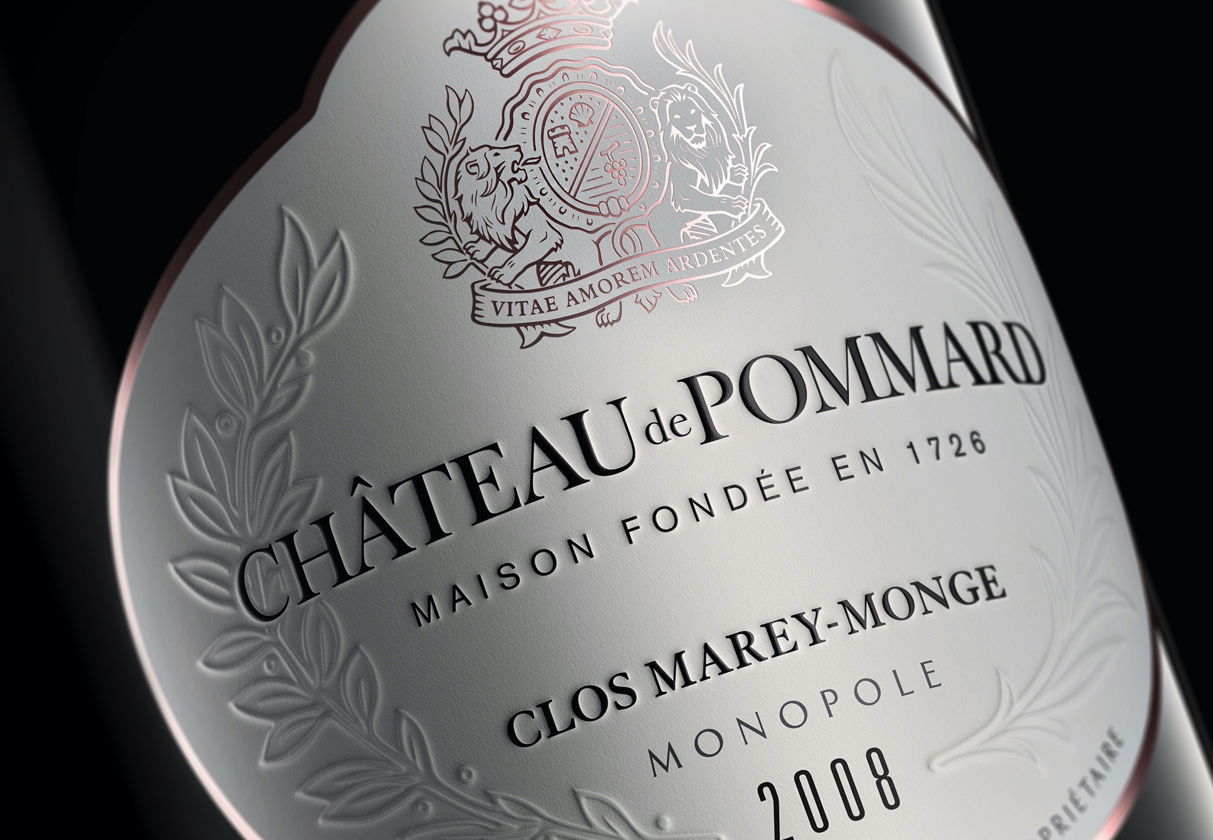
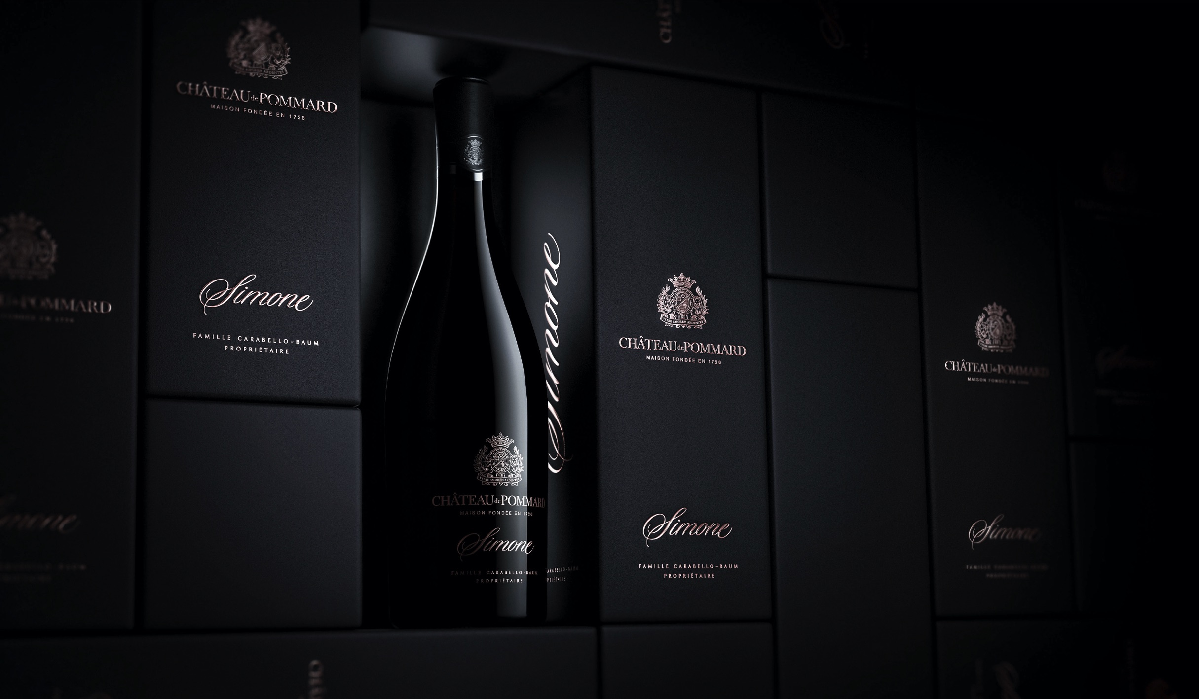
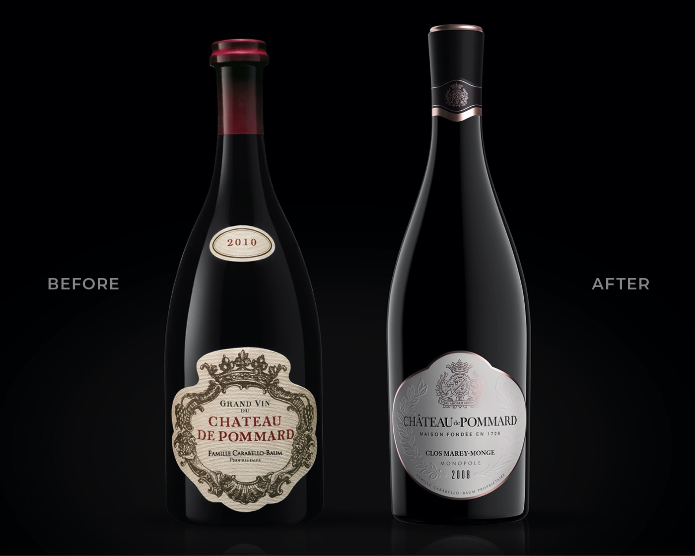
The graphic design perfectly embodied the new brand positioning "Fall in love with Life", boasting refined printing techniques & superb attention to detail. With the development an ownable pink foil colour tone as part of its brand assets, our team used the highest quality in finishings, from blind embossing on the labels, white varnishes, metallic substrates to screened details for the ultra-premium Cuvée. The packs have been carefully designed, conveying an unpretentious presentation full of elegance & poetry, seen across the whole portfolio.
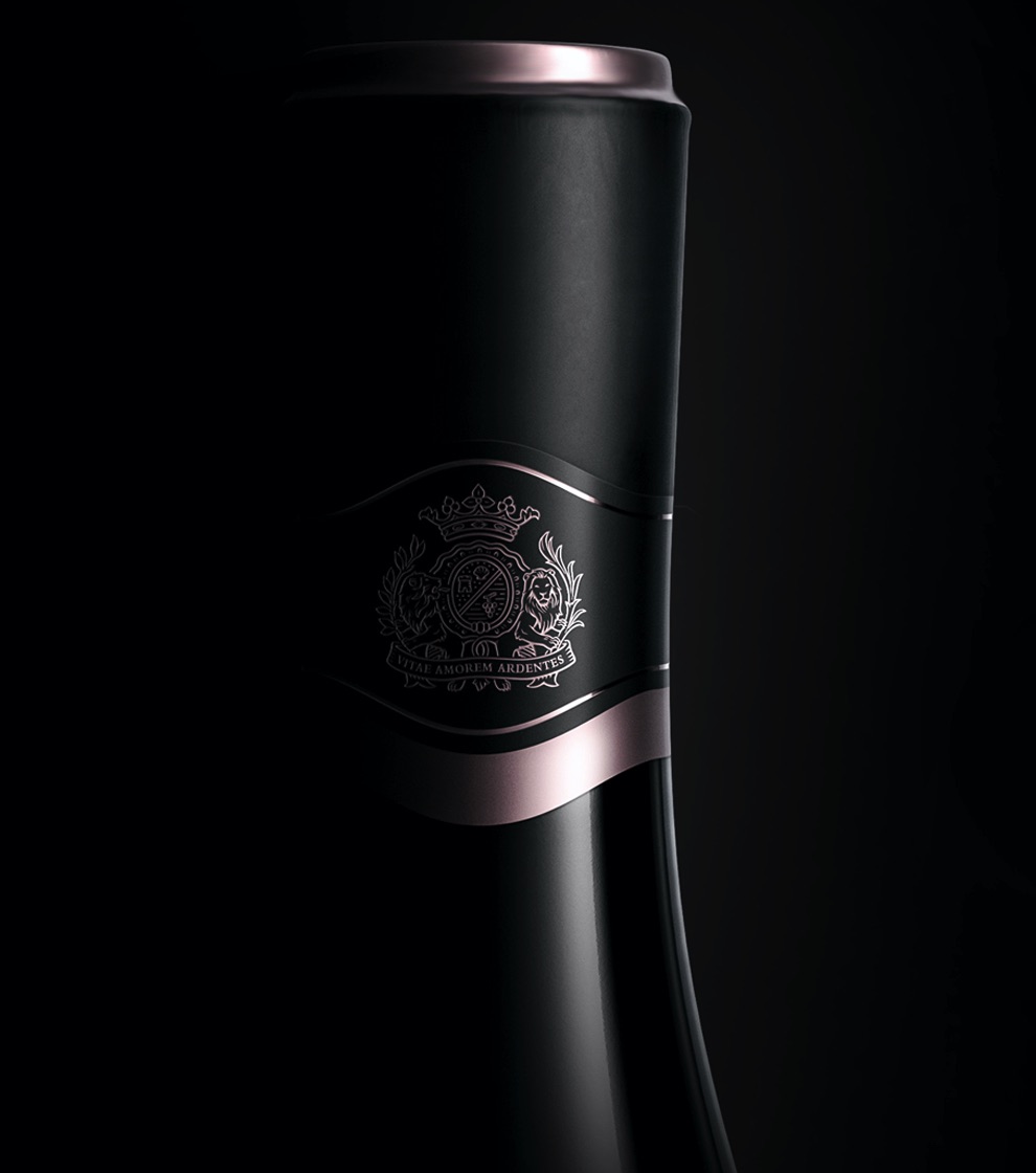
Beyond a graphic design that was shaking traditional burgundy wine style, our challenge was to go a step further by creating the purest bottle shape ever produced, with delicate contours to convey the innovative and honest values of the brand.
After months of trials, collaborating closely with the glassmaker, we brought to life the first bottle in the world ever produced without a neck lip, a subtle change to the eye that delivers an unexpected and truly unique shape.
Brand strategy
Structural design
Brand identity
Packaging
Collateral
Digital
Close the full story
“The team at Appartement103 are a rare find of top creative talents and humble collaborative minds. Our creations together have completely transformed our brand and our business.”
Michael Baum, CEO & Propriétaire, Château de Pommard
