SAULVAGE
Make A Mark project
Taking literal inspiration from 'Make a Mark', our team developed "Saulvage" whiskies, a concept to raise awareness, grab attention & express our commitment to Mother Nature unexpectedly.
Read the full story
SAULVAGE
Make A Mark project
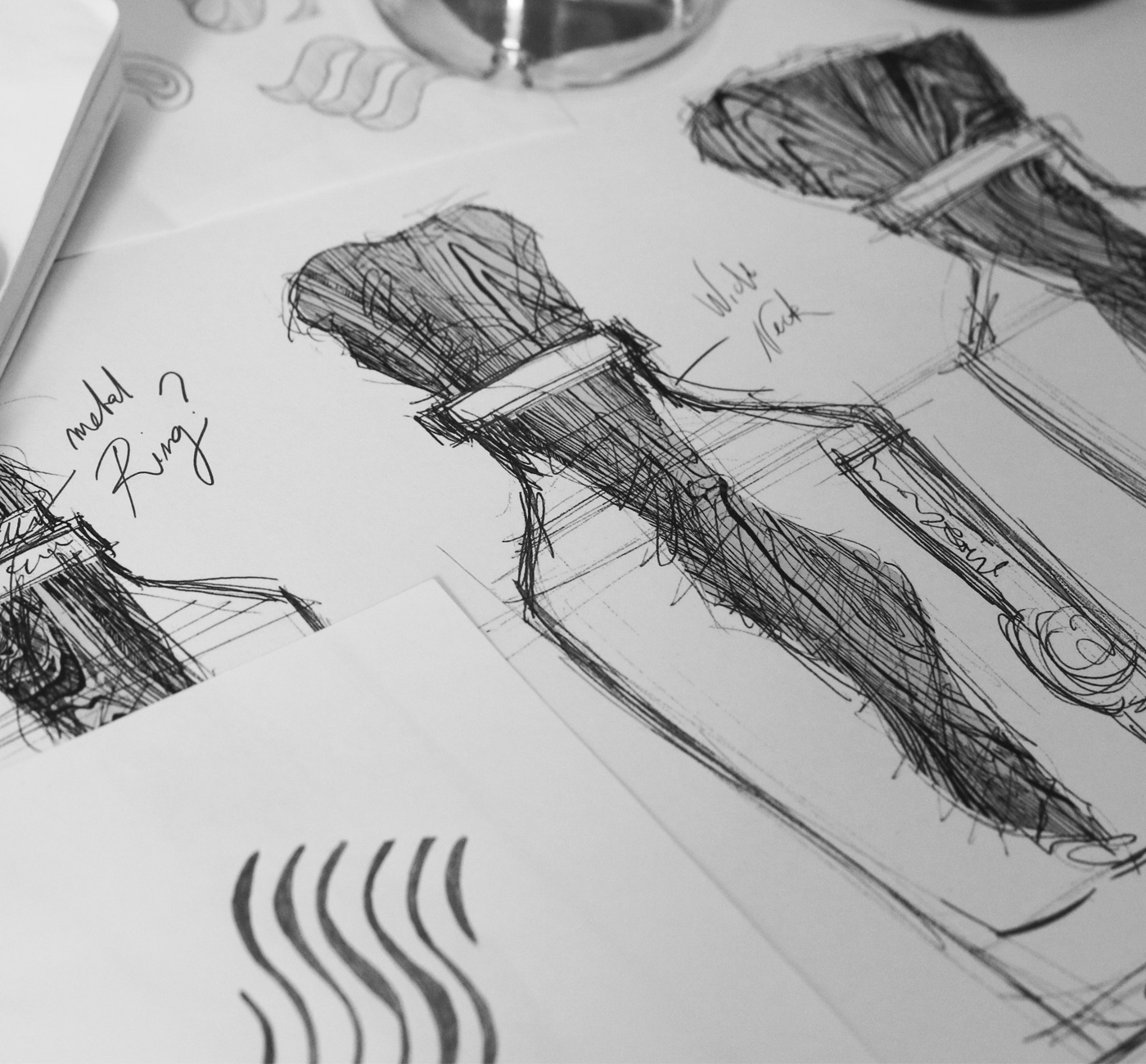
The Make a Mark project is the brainchild of three global leaders - ESTAL, AVERY DENNISON, and LEONHARDKURZ - bringing together some of the world’s top design firms to explore innovation in luxury packaging and inspire true talent. A project with the goal of exploring packaging innovations from a 360-degree perspective that includes glass, labels, finishing and design.
The final result designed by Appartement 103 was launched and showcased to the world at the Luxe Pack exhibition in Monaco earlier in October.
Taking literal inspiration from 'Make a Mark', our team developed a concept to raise awareness, grab attention and evoke a rescue "SOS message". Our way to Make a Mark is by unexpectedly expressing our commitment to mother nature.
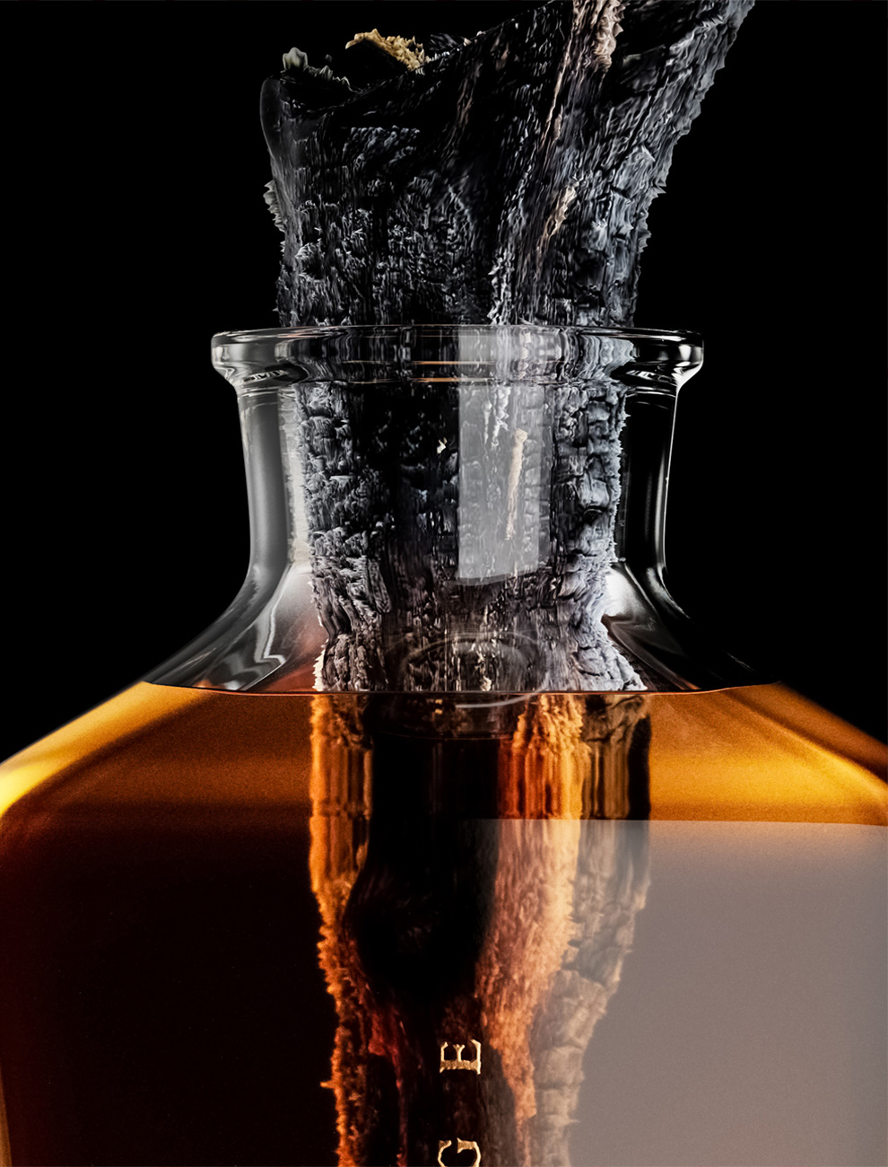
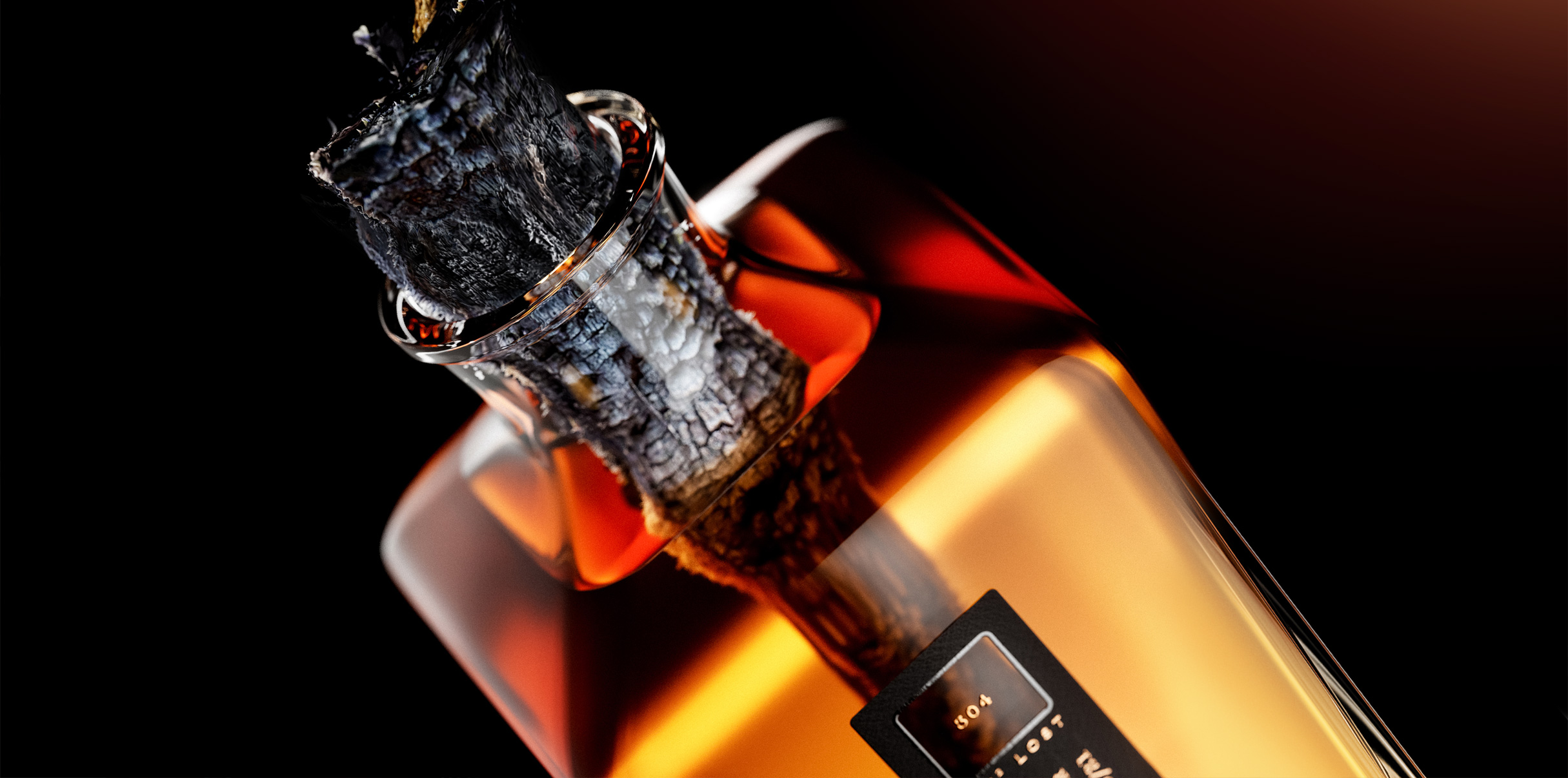
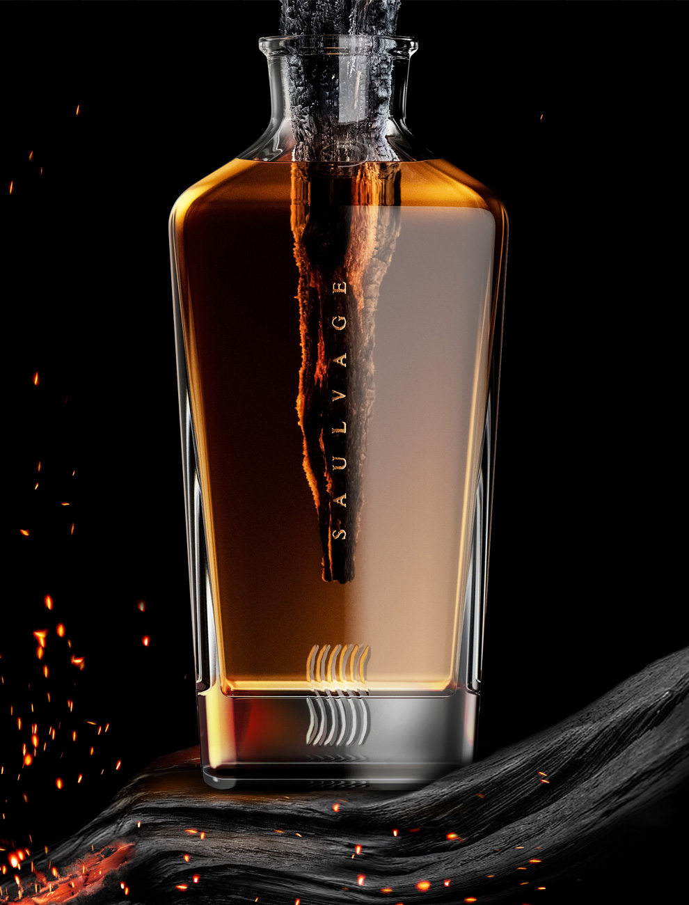
The use of wood is crucial in spirit-making. It enhances the flavour profile when aged in barrels and produces specific flavours when the wood is toasted. On the other hand, global warming and the era of Megafires are devastating our world increasingly.
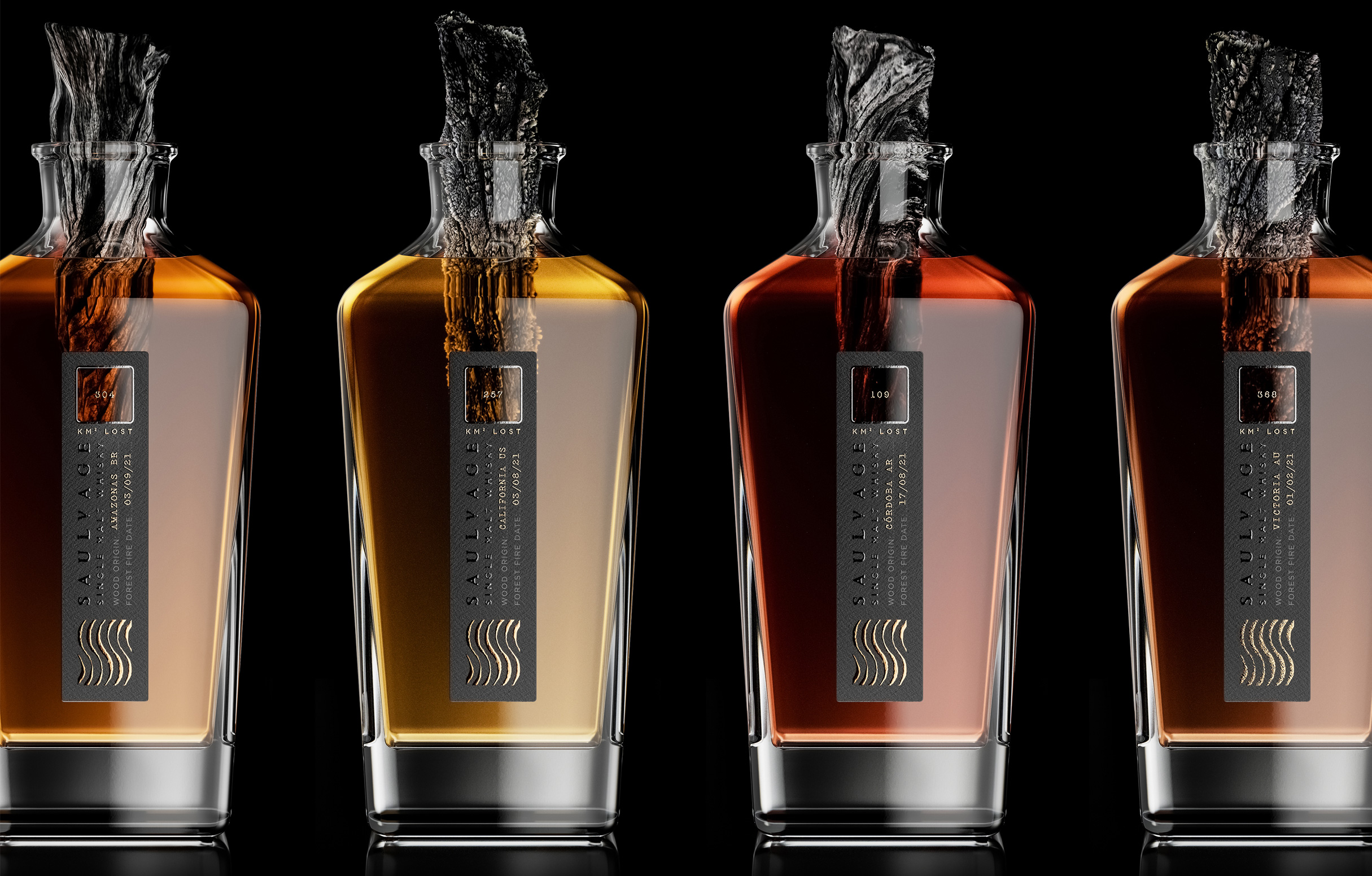
Saulvage whiskies create a bridge between destruction and creation; its name is inspired by the combination of "Sauvage", which means "wild nature" in French, and "salvage", which refers to rescuing an element in danger.
Each bottle of our whisky Saulvage is unique, consisting of a range that will grow with the release of a new SKU for each new megafire.
As a tribute to the victims of these catastrophes, each variant will highlight a burned wood piece that originated from fires worldwide in 2021. A poetical but provoking way to raise awareness of climate change and the challenges humanity faces.
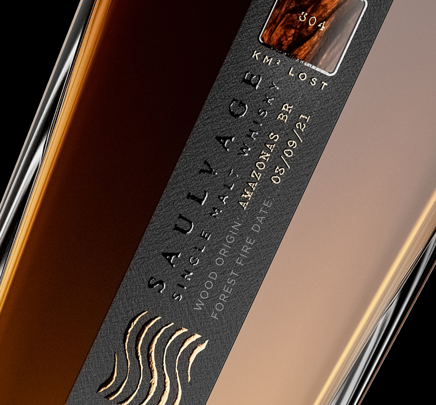
From the Amazon's loss of 304 km2 in September to California's 257 km2, or 368 km2 in Australia and 109 km2 in Argentina, every burned wood piece from these regions is plunged into our whiskies; as an organic element protected in formol, our wood stands as a relic to be never forgotten.
The side label highlights the origin of the lost wood through a play of hot foiling from Kurz, with a diecut window centred on the wood piece.
In addition, the "S" becomes a powerful communication tool understandable from far away through an optical graphic construction, becoming clearer like the destroyed forest when getting closer.
Using brand new recycled organic paper from Avery Denisson, it completes the concept with sustainable materials.
Make A Mark project
The Make a Mark project is the brainchild of three global leaders - ESTAL, AVERY DENNISON, and LEONHARDKURZ - bringing together some of the world’s top design firms to explore innovation in luxury packaging and inspire true talent. A project with the goal of exploring packaging innovations from a 360-degree perspective that includes glass, labels, finishing and design.
The final result designed by Appartement 103 was launched and showcased to the world at the Luxe Pack exhibition in Monaco earlier in October.
Taking literal inspiration from 'Make a Mark', our team developed a concept to raise awareness, grab attention and evoke a rescue "SOS message". Our way to Make a Mark is by unexpectedly expressing our commitment to mother nature.
The use of wood is crucial in spirit-making. It enhances the flavour profile when aged in barrels and produces specific flavours when the wood is toasted. On the other hand, global warming and the era of Megafires are devastating our world increasingly.
Saulvage whiskies create a bridge between destruction and creation; its name is inspired by the combination of "Sauvage", which means "wild nature" in French, and "salvage", which refers to rescuing an element in danger.
Each bottle of our whisky Saulvage is unique, consisting of a range that will grow with the release of a new SKU for each new megafire.
As a tribute to the victims of these catastrophes, each variant will highlight a burned wood piece that originated from fires worldwide in 2021. A poetical but provoking way to raise awareness of climate change and the challenges humanity faces.
From the Amazon's loss of 304 km2 in September to California's 257 km2, or 368 km2 in Australia and 109 km2 in Argentina, every burned wood piece from these regions is plunged into our whiskies; as an organic element protected in formol, our wood stands as a relic to be never forgotten.
The side label highlights the origin of the lost wood through a play of hot foiling from Kurz, with a diecut window centred on the wood piece.
In addition, the "S" becomes a powerful communication tool understandable from far away through an optical graphic construction, becoming clearer like the destroyed forest when getting closer.
Using brand new recycled organic paper from Avery Denisson, it completes the concept with sustainable materials.
Storytelling
Concept
Brand identity
Structural design
Collateral
Close the full story