STILLY
Brand creation
Challenging the RTD market by creating an all-new category with STILLY, an unique & qualitative cocktail brand from Minnesota.
Read the full story
STILLY
Brand creation
When two residents of Stillwater, Minnesota, Nick and Amanda Barthelemy, set out to develop a category of beverages called a "stilly," they understood the responsibility of the task that stood before them. RTDs (ready-todrink) and Hard Seltzers are booming in the US and abroad. However, the first wave of market entries saw the rise of many mainstream brands with lower perceived quality and artificial flavours. STILLY positions itself as a premium alternative.
In fact, STILLY challenges every aspect of the RTD (ready-to-drink) market by offering consumers a more premium and qualitative product.
STILLY beverages are NOT seltzers, and they're not your ordinary cocktails in a can; they're an all-new category of unique adult beverages called a "stilly. It's a light and refreshing cocktail made with premium vodka or other distilled spirits, fine bubbles, a squeeze of natural juices, and natural flavours. The exact ingredients and processes used to make a "stilly" are a closely guarded secret. However, a "vodka stilly" starts with STILLY vodka,
developed to be of superior quality, exceptionally smooth, and distinctive to accentuate the fruit flavours present in the drink.
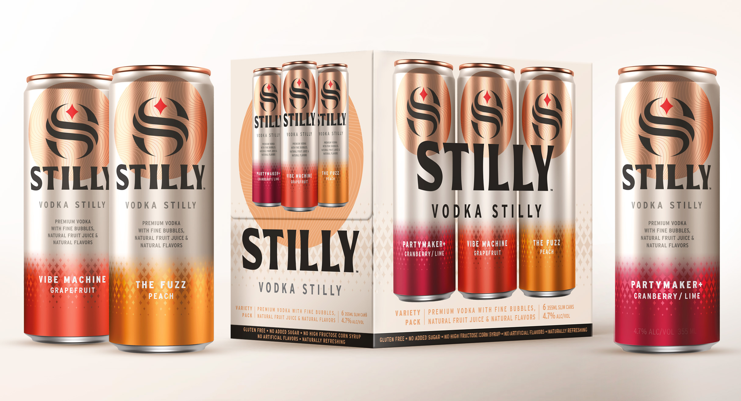
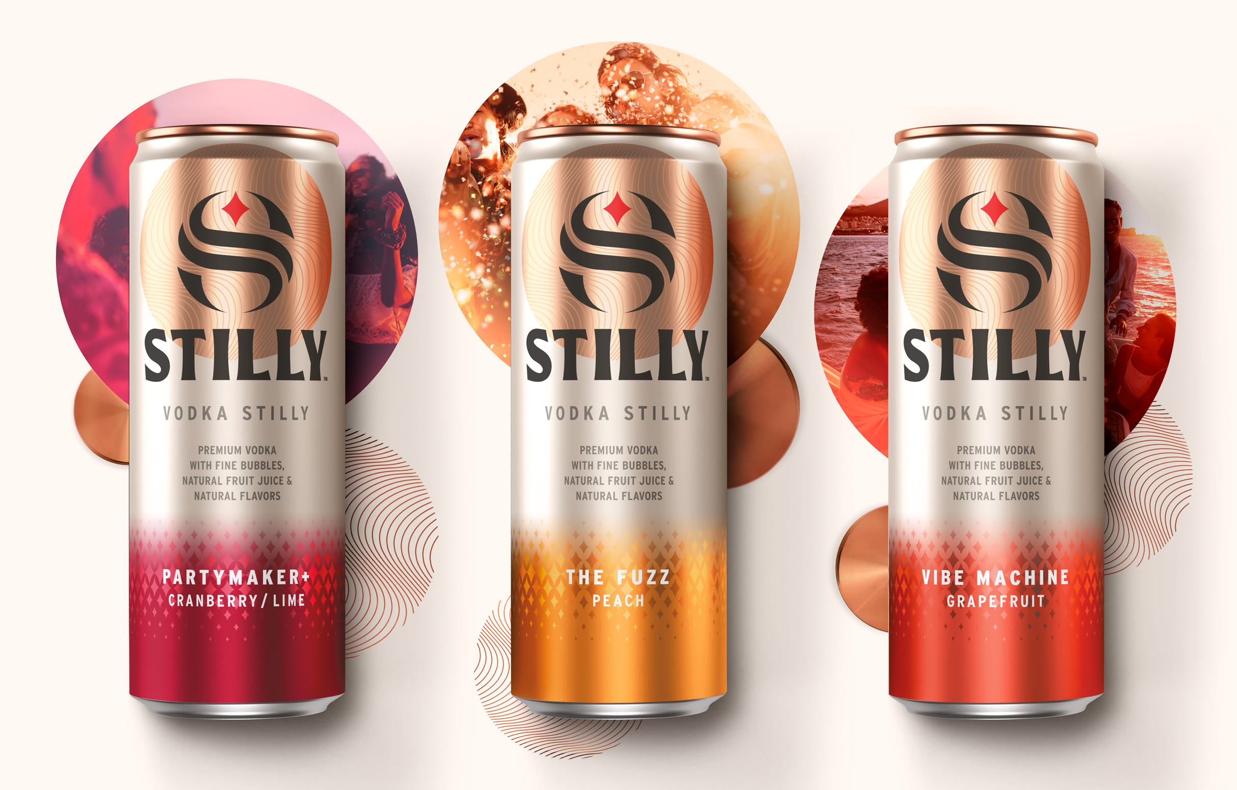
The company offers three distinctly delicious flavours of the "vodka stilly" in a variety pack (6 cans/3 flavours) of 12 oz slim cans. The three varieties available now include "Partymaker+" (cranberry lime), "Vibe Machine"
(grapefruit), and "The Fuzz" (peach).
With the main objective defined, STILLY's brand world follows a lifestyle and emotional approach. The keywords revolve around pleasure, cheerful effervescence, and sharing. Appartement 103 created an impactful design with unique visual assets to ensure the brand stands out.
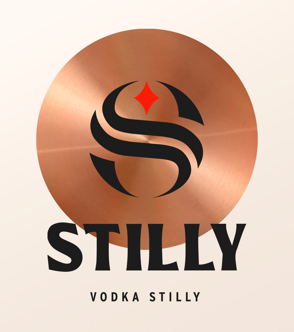
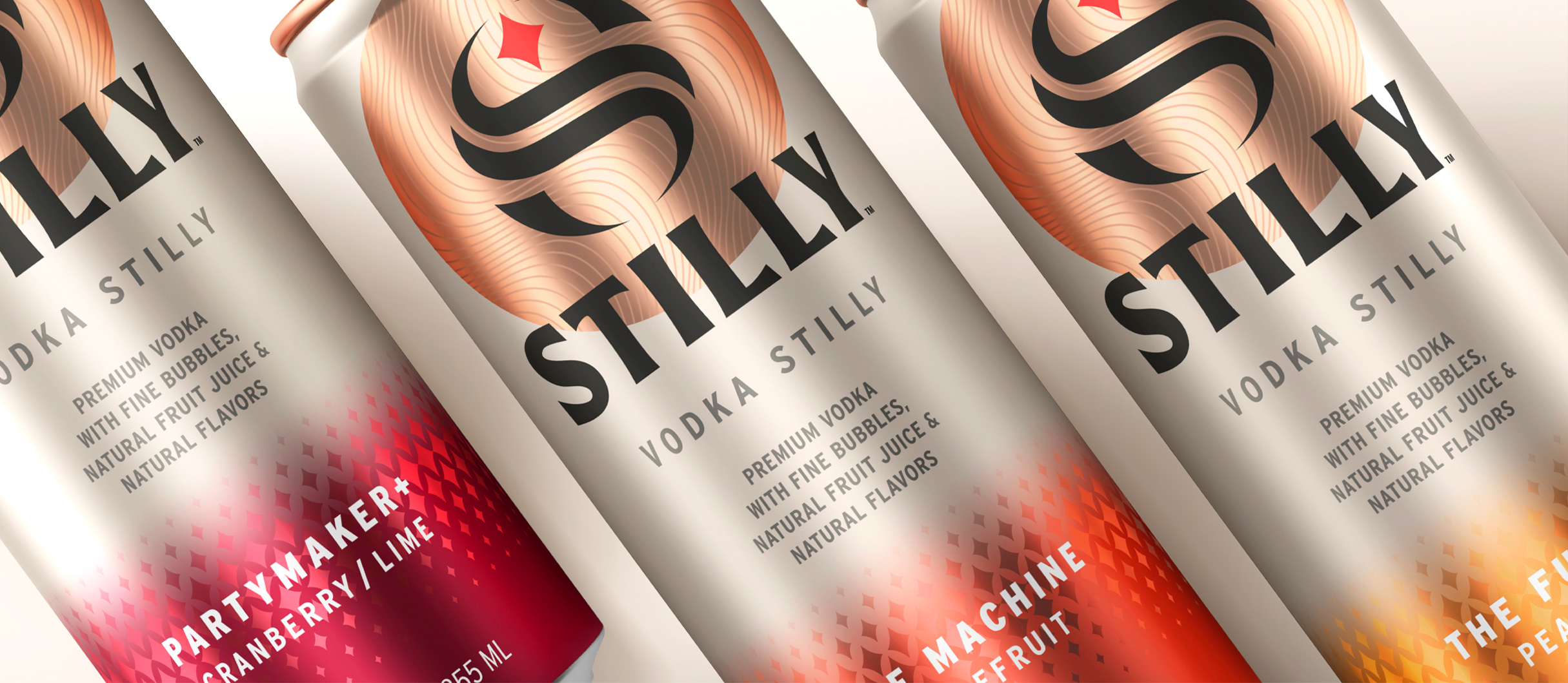
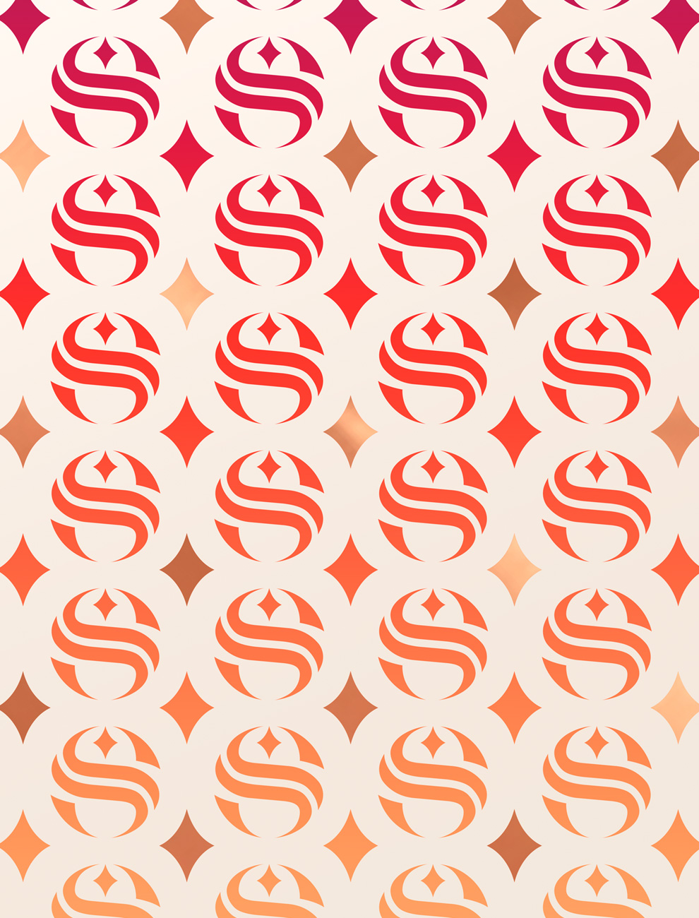
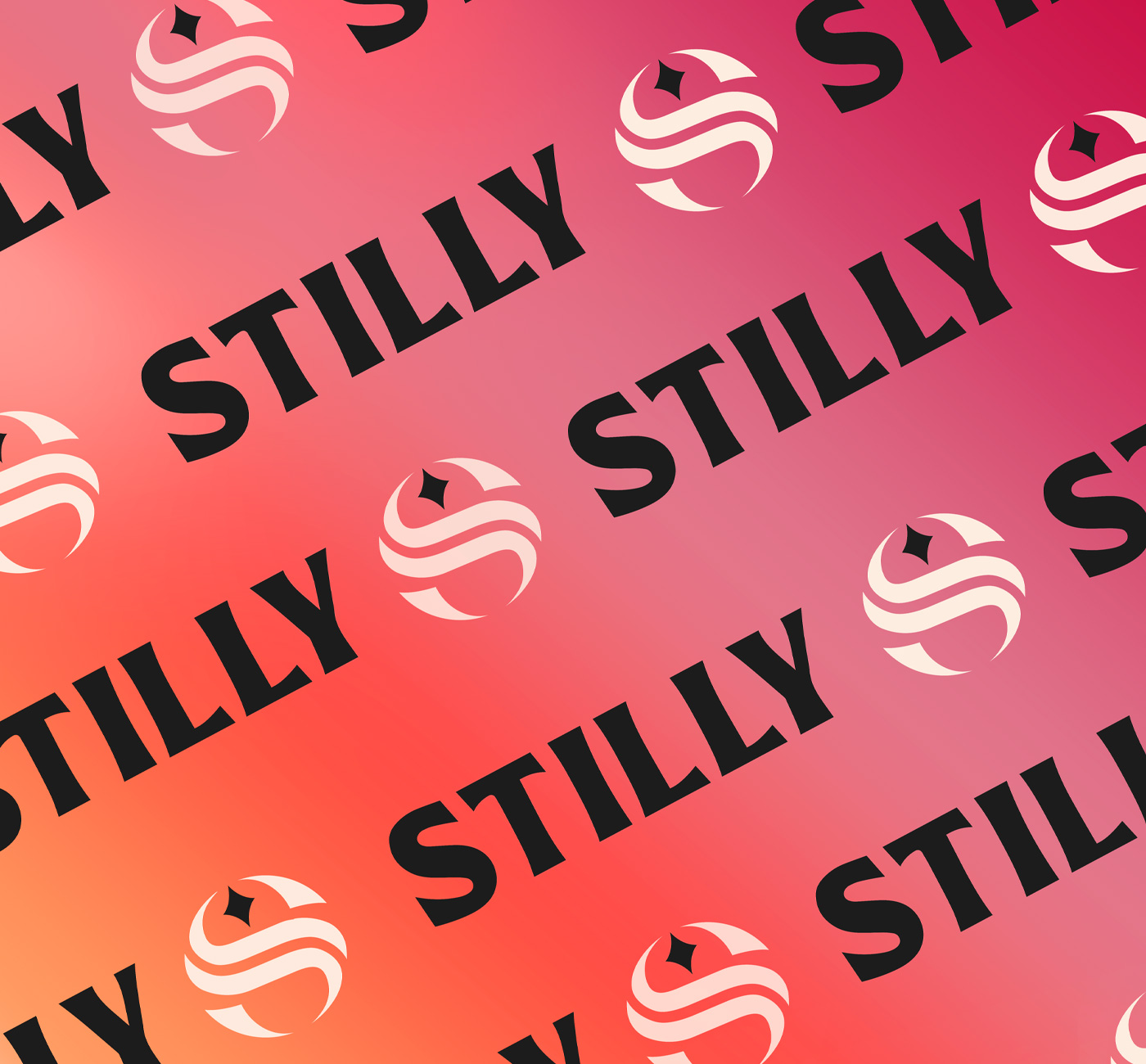
The packaging architecture works with two main segments; the top part functions as the brand badge, while the bottom conveys the flavour specification, allowing for the creation of an extended portfolio. The "iconic S" acts as a powerful communication tool which can be used across many different touchpoints; it evokes the notion of fluidity and mixology with the curved lines. It also serves as a nod to St. Croix river that crosses Stillwater, where the brand comes from. As an inspiring means to guide the way, the red star symbolizes Stillwater and Minnesota's motto: «L'Etoile du Nord".
Furthermore, the copper circle anchors the brand, enhancing visibility and contrast; also evoking the production process, which involves distillation in copper stills. It connects with the brand world, expressing a feeling of togetherness and memorable moments in a circle of friends.
Using black capital letters adds personality and character to the logo, enhancing brand impact.
The lower part of the pack uses luminous, radiant colours complemented by the star icon pattern bringing vibrancy and elegance.
Launched in Minnesota, it has received an overwhelmingly positive reaction from consumers, a very successful launch that reassures their plans to go nationwide as a next step.
Brand identity
Packaging
Collateral
Close the full story
"When we began to think about what we wanted to achieve, we knew we had to do justice to the STILLY brand.
This is why we sought out the proven creative talent of Appartement 103. The creative genius exhibited in the library of Appartement 103's past work for some of the most recognizable and well-respected names on the planet, such as LVHM, spoke volumes about our ability to trust them to help with the development of the STILLY brand."
This is why we sought out the proven creative talent of Appartement 103. The creative genius exhibited in the library of Appartement 103's past work for some of the most recognizable and well-respected names on the planet, such as LVHM, spoke volumes about our ability to trust them to help with the development of the STILLY brand."
Nick Barthelemy, CEO, and cofounder of STILLY SPIRITS, LLC.
